
Enabling learners to organise their e-learning experience
Working at Kiron has been fulfilling, challenging, transformative.
- Role Solo product designer, end-to-end research and design
- Industry Edtech (B2C, B2B)
- Challenge Learners lose track of programs they want to enroll in later
- Research Qualitative interviews, usability testing, market research
- Constraints Design solution should fit a 2-week sprint
- Duration 1 week of discovery research, 1 week of design + usability testing
About Kiron: working for an NGO
After my startup initiative came to an end, I started looking for a UX Designer position in Germany. Since it was my very first job search, I had no clarity yet on what I would like to do and where I would like to work. So, I was lost in a vast sea of rejections. 🐳 I wrote an article on that.
By the third month, when the company I was most enthusiastic about rejected my application, I felt quite hopeless. 🥲 It was that very night that I realised I wanted to work on something meaningful, prompting me to google "NGOs in Germany". And that is how I found Kiron.
At last, one less hat
At Kiron, my role as the sole Product Designer involved user research, UX & UI design for new features and improvements, as well as creating and maintaining the design system. On top of that, it required collaboration with various stakeholders. At last, I could put down the developer hat, but never for a minute did I not use that knowledge to my advantage. 😎
Welcome to Kiron campus
Kiron offers free online education to more than 175k refugees and underserved communities worldwide, providing a diverse range of educational programs on its online campus. The target group is called the learners.
One common pain point amongst the learners was that they enrolled in a program, so they wouldn’t forget about/lose it, even if they did not plan to study it right away. However, this resulted in a cluttered overview page of enrolled programs.
The case study I've picked for Kiron is to show how I solved this trivial problem.
A new feature request
Adding items to a Wishlist was initially a feature request by a partner organisation. Wait, what, who is this now? Besides providing free education to refugees and other underserved communities, Kiron also offers its campus as a white-label platform to partner organisations, which have their own target groups.
Upon getting partner requests that affected Kiron learners, I conducted research to discover the impact, as I wanted to understand if and how the Wishlist would be useful to them.
On the one hand, I was responsible for the experience of Kiron learners. On the other hand, I needed to make sure that the white-label partners and their target groups were also satisfied with the solution.
First things first, we do research
I conducted qualitative interviews with 7 Kiron learners. Through this research I discovered that a Wishlist had been a long-standing unmet need that they circumvented by enrolling into programs.
To synthesise interview data, I used a version of the Atomic UX Research Canvas on FigJam. For every question, I separated the facts (their current pain points) from the insights (how I interpret the facts). Then I extracted opportunities (how we could design the solution).
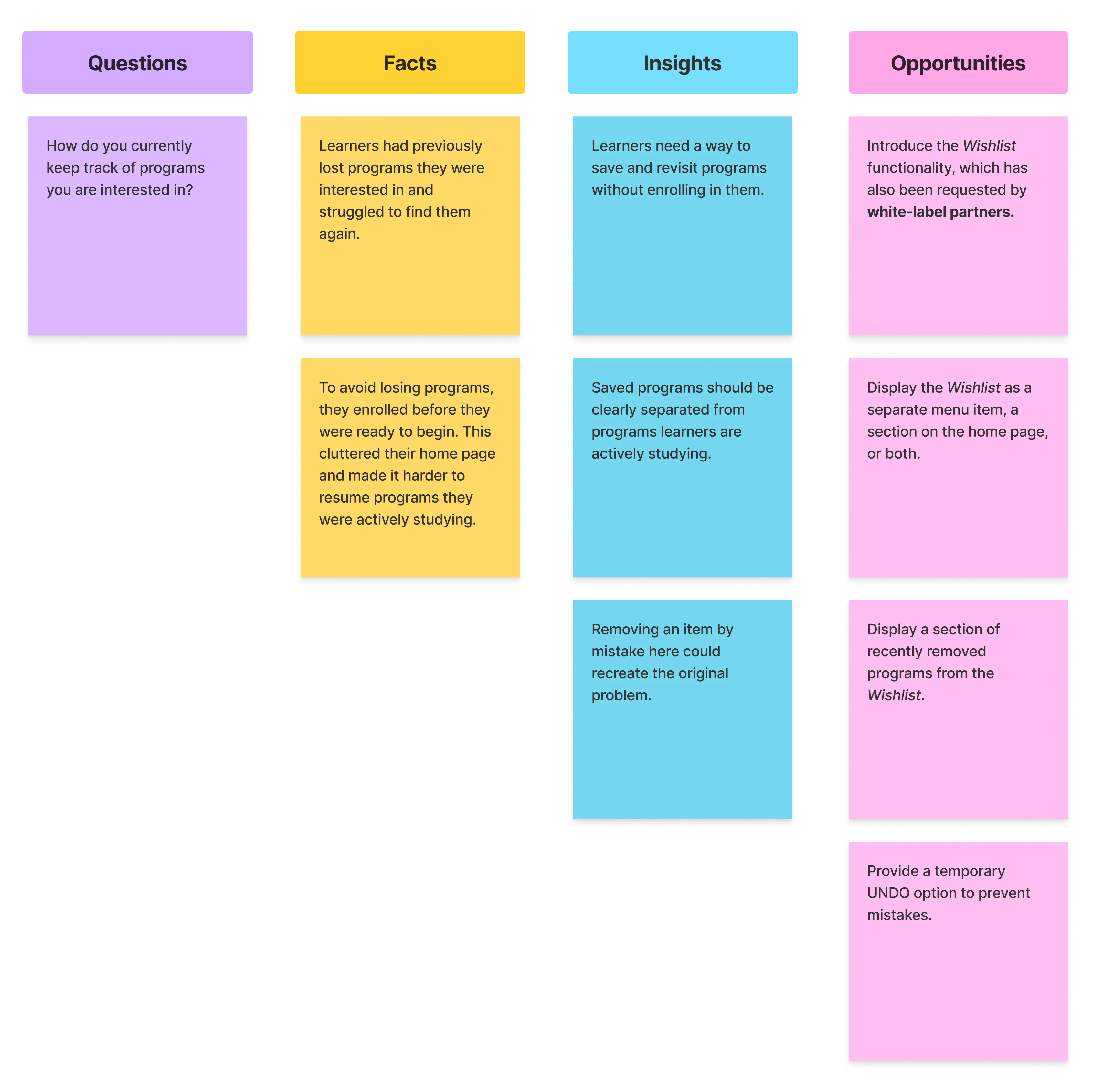 Atomic UX Research Canvas on FigJam — separating facts, insights, and opportunities
- How do you currently keep track of programs you are interested in?
Question:
- Learners had previously lost programs they were interested in and struggled to find them again.
- To avoid losing programs, they enrolled before they were ready to begin. This cluttered their home page and made it harder to resume programs they were actively studying.
Facts:
- Learners need a way to save and revisit programs without enrolling in them.
- Saved programs should be clearly separated from programs learners are actively studying.
- Removing an item by mistake here could recreate the original problem.
Insights:
- Introduce the Wishlist functionality, which has also been requested by white-label partners.
- Display the Wishlist as a separate menu item, a section on the home page, or both.
- Display a section of recently removed programs from the Wishlist.
- Provide a temporary UNDO option to prevent mistakes.
Opportunities:
The research also revealed further opportunities for more complex features, such as custom lists and list sharing. These were regarded as out of scope for the first iteration.
The agile UX
Kiron worked with Scrum. This meant that the stickies with opportunities on how to design a Wishlist needed to be converted into user stories and prioritised for a 2-week sprint.
To help with prios, I used the Impact Effort Matrix. This matrix is of great help in determining the most effective course of action. At that point, I discussed the results with the Product Owner to be on the same page.
Regarding the accidental removal of a Wishlist item, we decided on the temporary UNDO action because it offered high impact and low effort. A recently removed section addressed the same problem, but required more interface and implementation work.
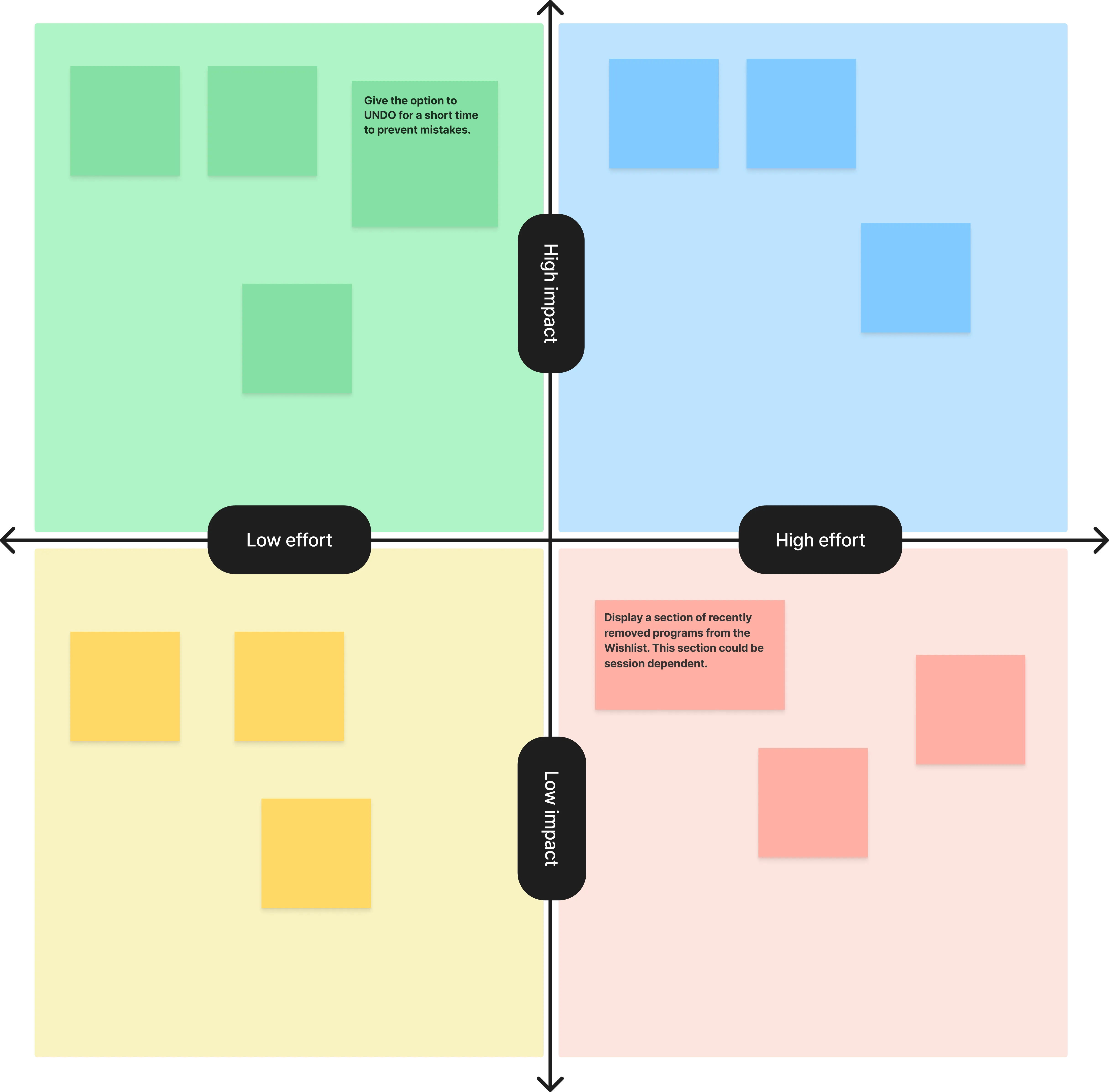 Impact Effort Matrix — used to prioritise the design opportunities
In parallel, I delegated a market research task to the designer from the communications department to investigate how other platforms handled removing saved items from wishlists. The research also confirmed that UNDO is quite an established pattern.
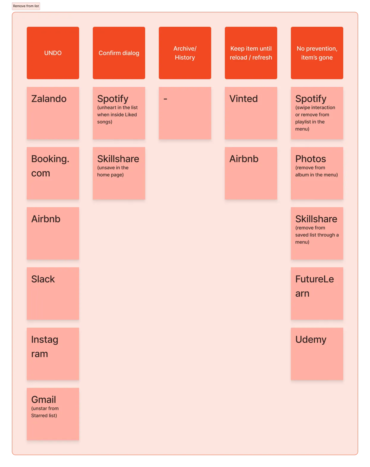 Market research comparing patterns for removing saved items
Now it's time to design. Beep bop boop.
The design system to the rescue
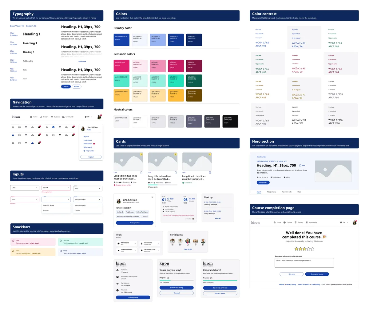
I cannot emphasise how obsessed I am with working with components. After all, I am a Bounding Boxer. I am also very proud of the design system I have built at Kiron. It made work so efficient. I organised the component/pattern library of the design system into Atoms, Components, Cards, Compositions, and Pages.
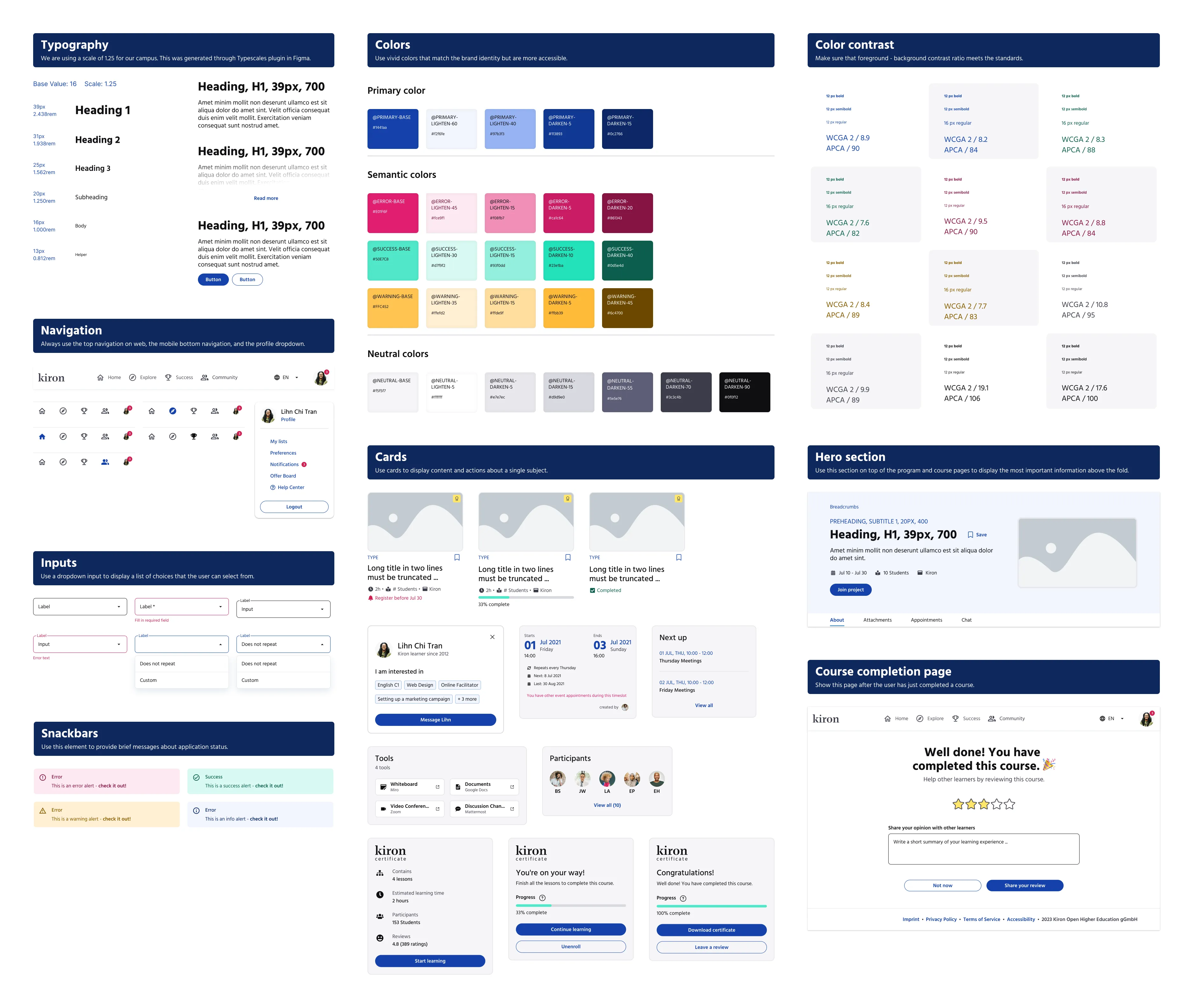 A snippet of the Kiron design system component library
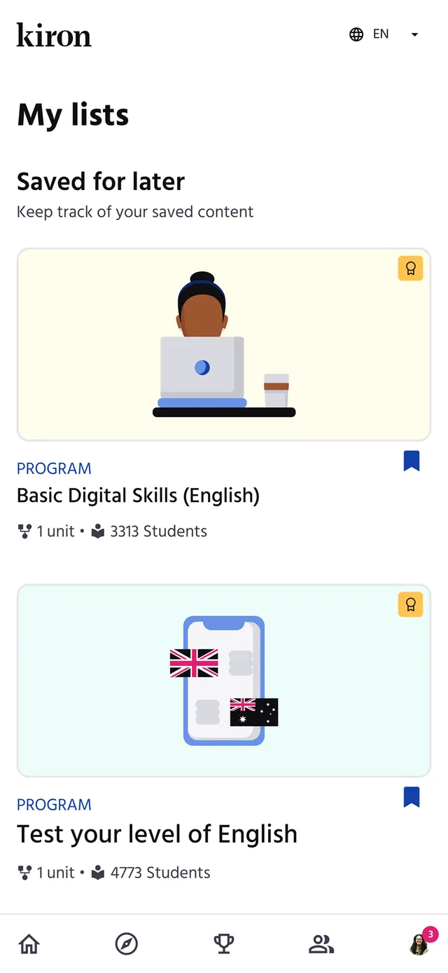
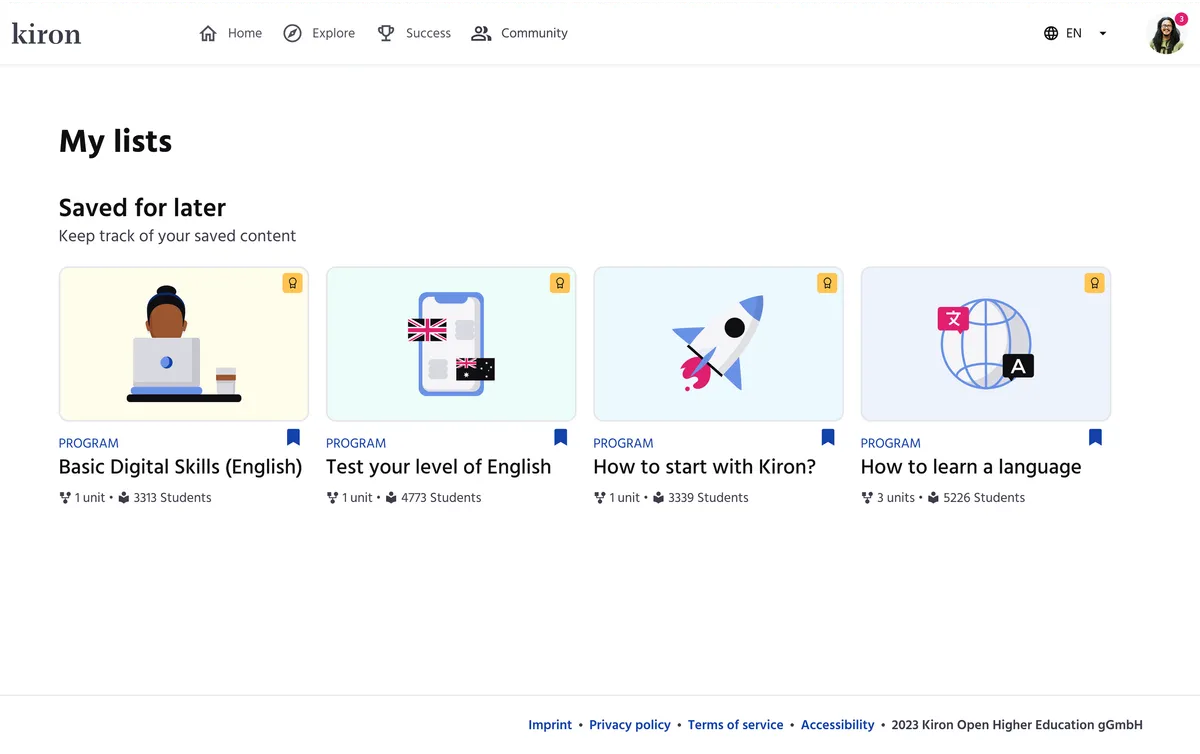
For this use case, I had to create a new page to show the Wishlist, so I grabbed the top & bottom navigation, text components, profile dropdown, and program cards to compose it together. Note that the page is called My lists, since we are expanding with the custom lists functionality later.
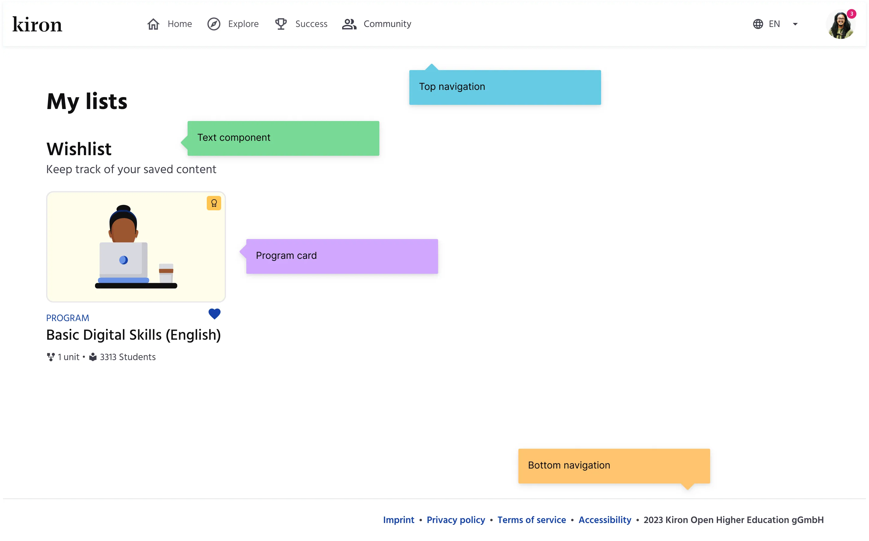 My lists page composed of top navigation, text components, program card, and bottom navigation.
The entire interactive prototype took a couple of hours to be ready for some usability testing. Woop woop.
A wish come true
Before testing the design with the learners, I checked the feasibility with the dear developers, who in addition made sure that I could deliver the best work.
I had chosen the heart icon for saving, so the devs naturally questioned if that was the right choice (heart = like) and if that would scale with custom lists. Sharp brains. Hence, I switched to the bookmark icon.
All settled, now, how do the learners use it? I could test the new design with only 4 learners, and it turned out, saving/removing a program to/from the Wishlist was straightforward.
However, the term Wishlist caused confusion for two of them, as it could mean a list of programs that the learner cannot access right now, but would like to have.
I then decided Saved for later would suit the purpose of this list the best. Additionally, it uses simpler language and it can be easily translated into other languages as well.
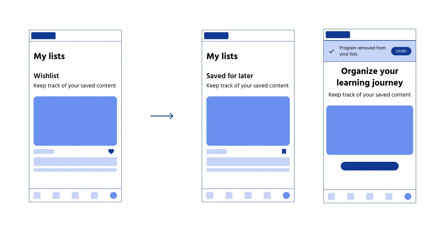 Overview of the mobile screens for the Saved for later feature
A better learning experience
How many learners use it? What are the touch points of interaction? For instance, they may engage with it on their personalised home page, while exploring new programs, or inside a specific program page. Do they notice and use the UNDO functionality? How did this feature impact their learning experience?
While I'm no longer present to ask these questions, the answers will undoubtedly influence the future versions of this feature.
Refer to the final designs below.
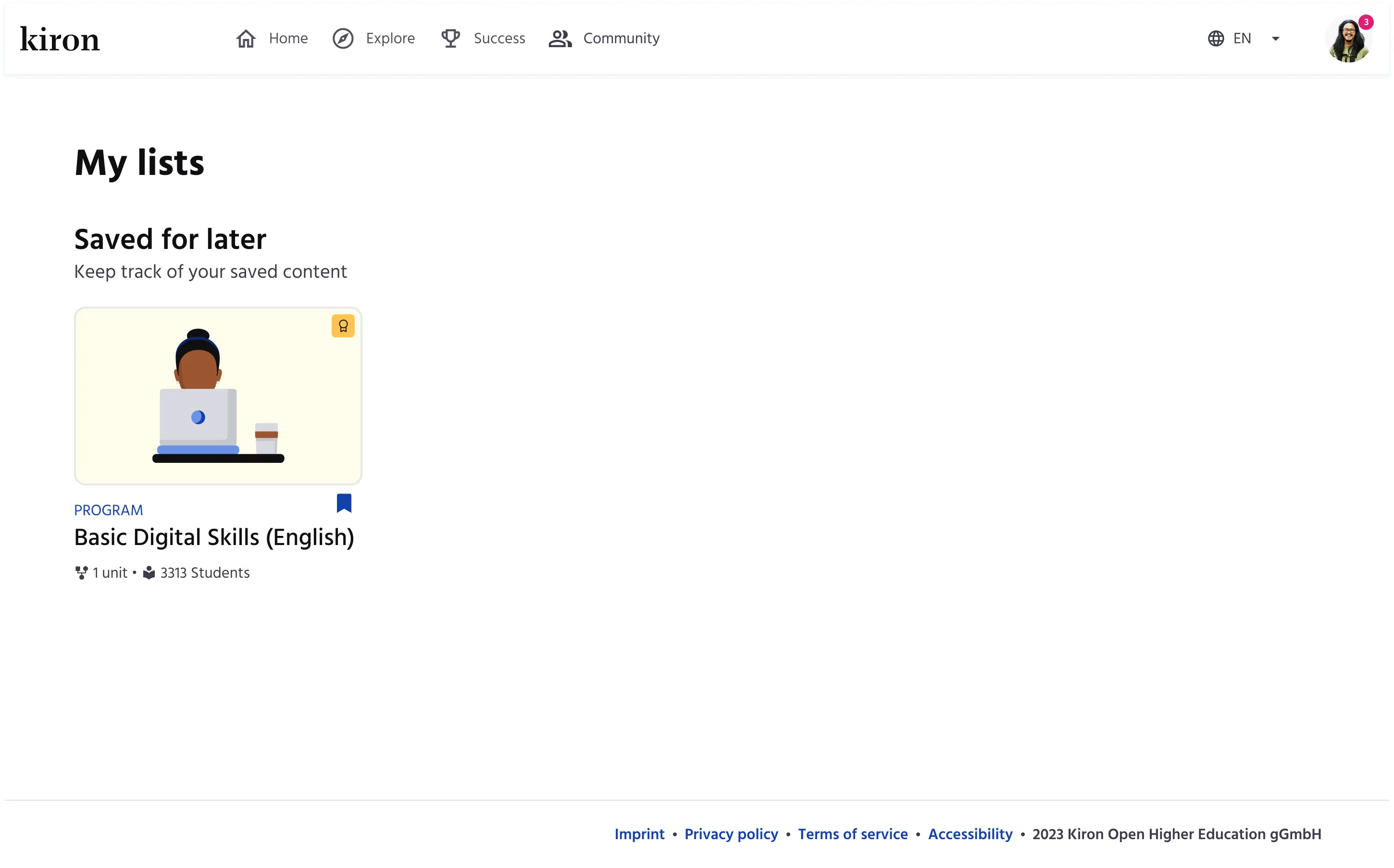 Final hi-fi design of My lists page - One saved program
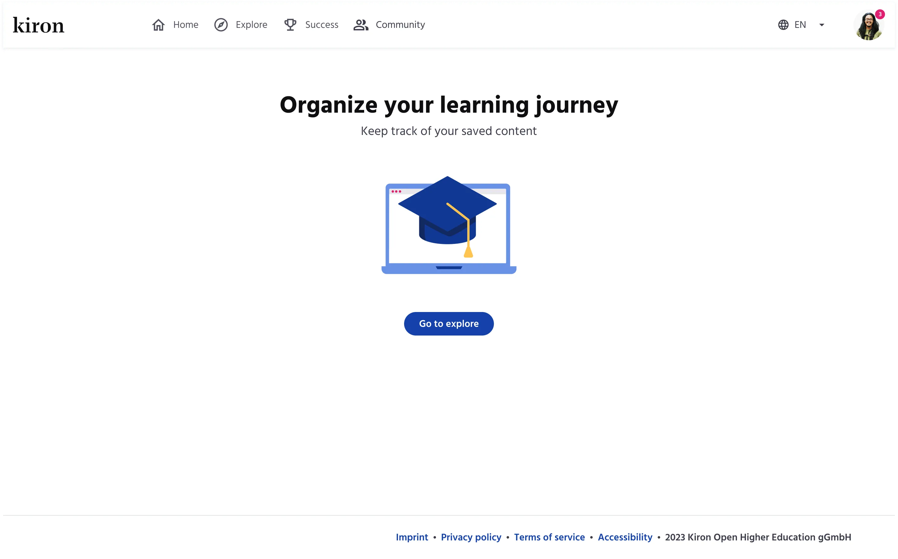 Final hi-fi design of My lists page - Empty state
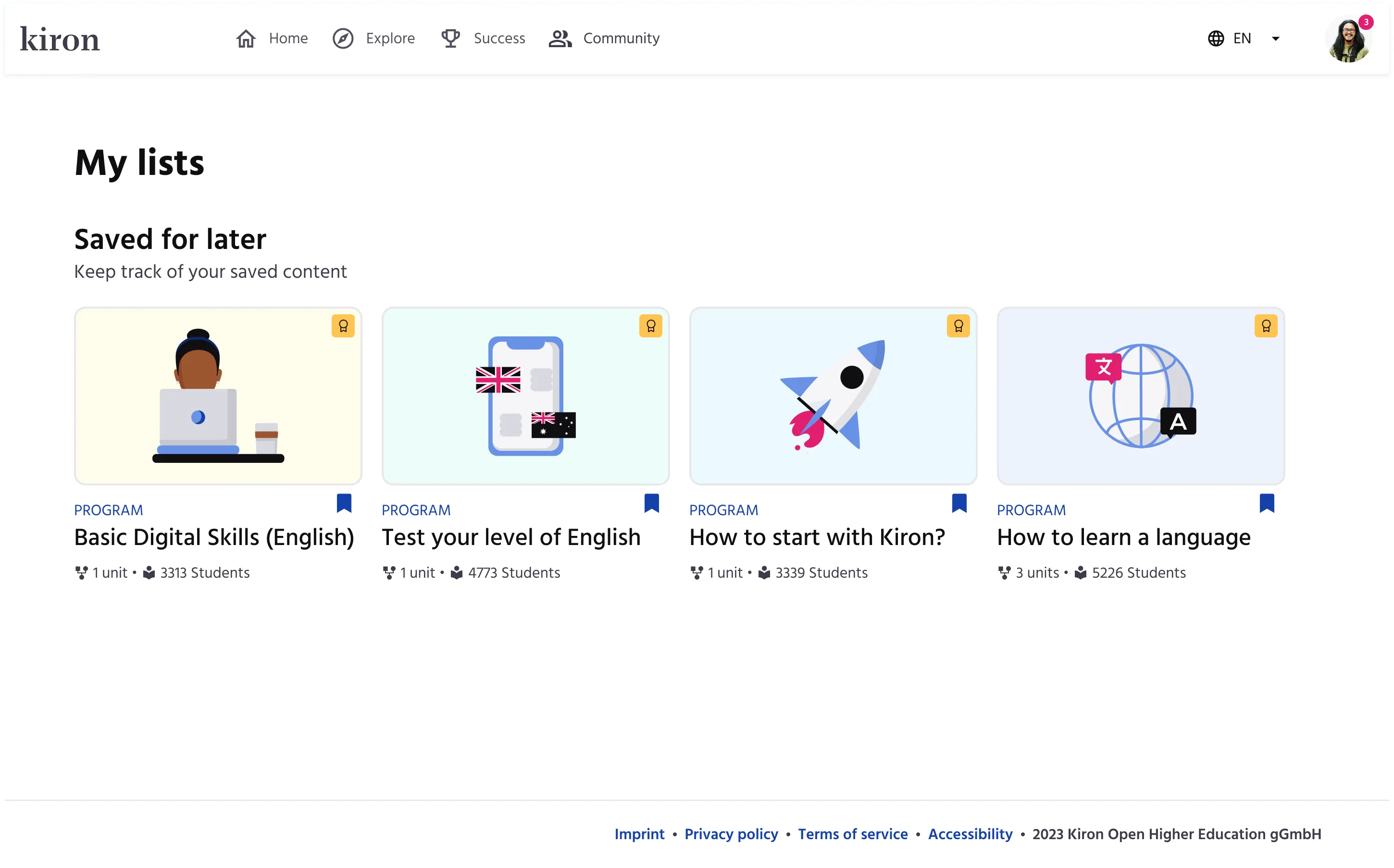 Final hi-fi design of My lists page - Four saved programs
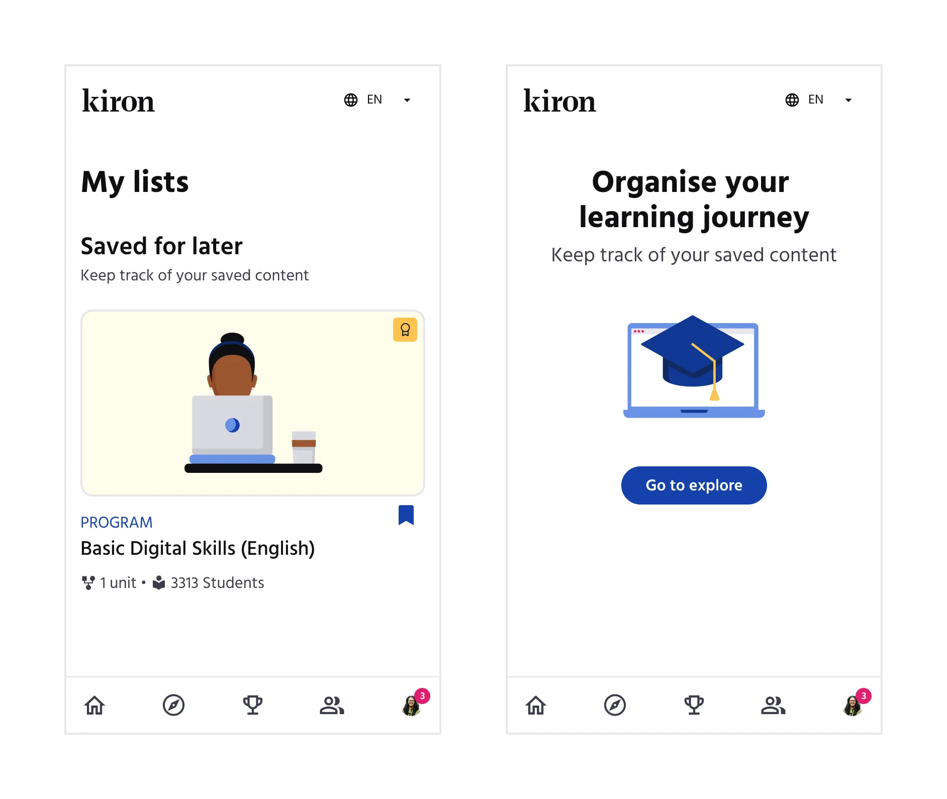 Final hi-fi designs of My lists page - Mobile version
What would I do better?
This was quite a trivial design challenge, but it wasn't without a little friction.
We released the feature as the Saved for later list, but the white-label partners pushed back and requested the original Wishlist term.
Although they agreed once I explained the rationale, it was clear that such decisions affecting multiple stakeholders, no matter how small, should be aligned before release.