
Visualizing UI pattern relations through interactive prototypes
My master's thesis marks the beginning of my UX design career.
- Challenge Turning a complex academic taxonomy into something usable
- Industry Academia
- Target Audience Designers, developers, students
- Device Web & Mobile
- Research Qualitative interviews, usability testing, SUS, UEQ
- Steps 7 design iterations through user evaluations
- Constraints Limited screen estate, different target groups, cognitive load
- Duration 6 months
- Impact 7 interactive prototypes of different application types, such as e-commerce, booking, food, music, news, photos, and social media (108 patterns in total)
About kiwi: my master’s thesis
After being introduced to the UX world during my master’s degree at RWTH, I knew I needed to pursue this path. That lead me to write a master’s thesis with UX design focus 🧐.
Together with my partner in crime, Tina, another RWTH student, we built kiwi, a UI design pattern library. It was inspired by Christopher Alexander, the father of the pattern language. Why a UI design pattern library? One word: science. 🔭
My main goal was to collect, design, and connect UI design patterns scattered around on the vast internet. For the scope of my thesis alone, I focused only on mobile patterns. 📱
Tina extended the library with UI components and guidelines.
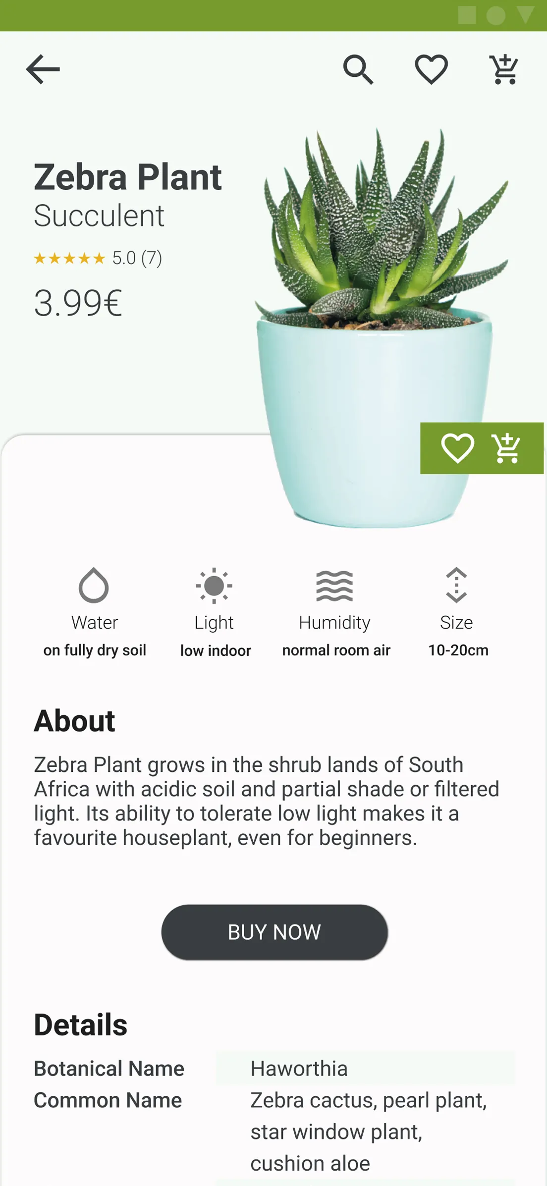
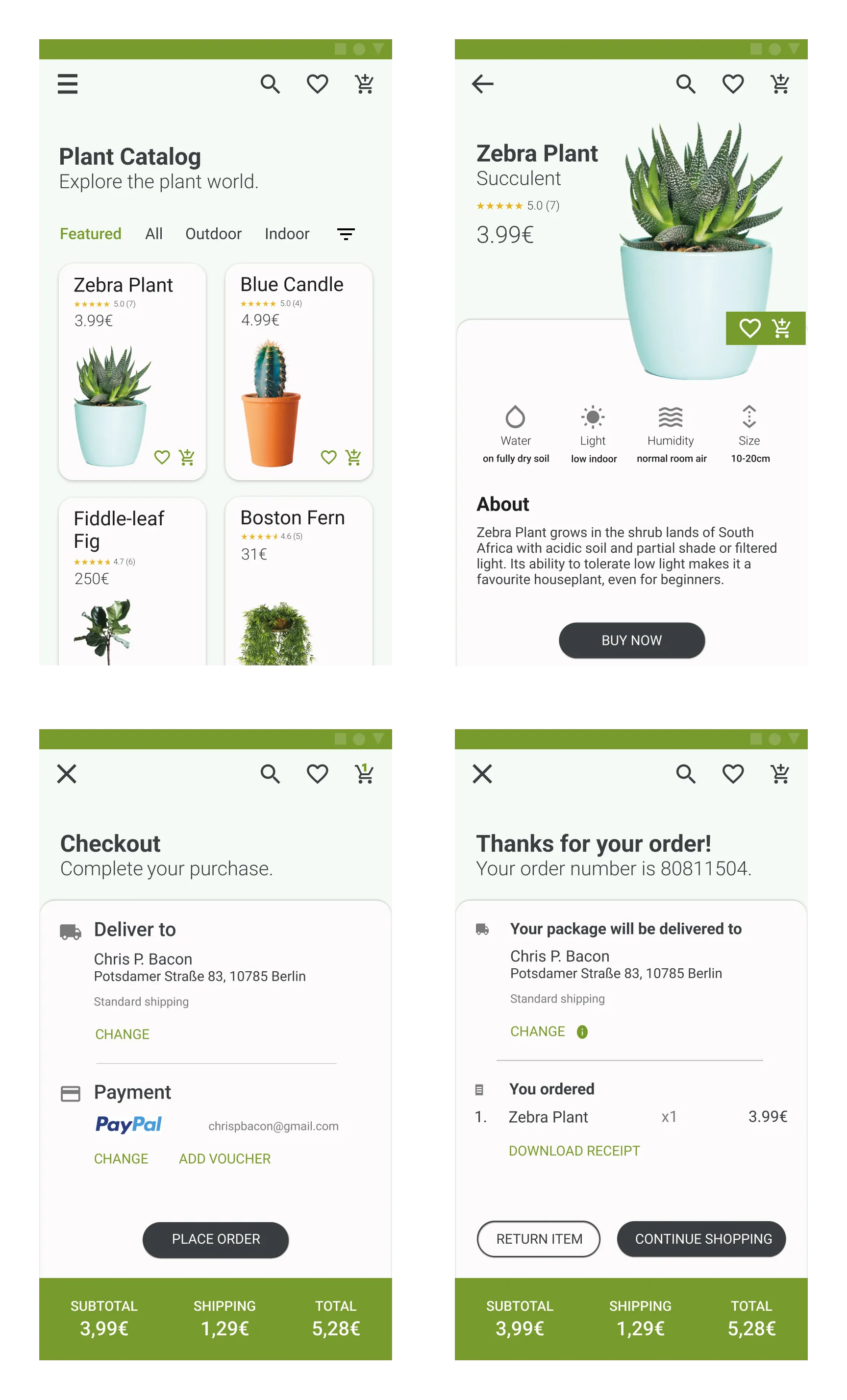 Four mobile patterns of the e-commerce application type: Product Catalog, Product Page, Checkout, and Order Confirmation
On wearing multiple hats
Whoever has ever written a master’s thesis knows the drill. As many other glorious soldiers, I wore several hats over that one year, from academic researcher to UX designer 🎩, UX researcher 🎓, UI designer 👒, web developer 🧢, life-choices-questioner ⛑️, and so it goes. 🥲
For the greater good
We targeted product designers, developers, and design students with the aspiration to assist them in their workflows.
The pain points around workflows
To guide our design decisions, we first sought to identify the pain points of our target groups in their workflow. We discovered that:
- Designers have to compromise on the quality of the UI design due to time constraints.
- Design students feel overwhelmed by the scattered UI design knowledge among numerous sources such as websites and books.
- Developers feel unable to reproduce the same quality of the UI design due to lack of such knowledge.
Visualise complex relations
For the purpose of this portfolio, I will focus only on one particular case study during the design of kiwi. As we navigate complex systems, it is observed that patterns work best not in isolation, but when they are used together with other fellow patterns. That’s how they create an experience based on validated best practices.
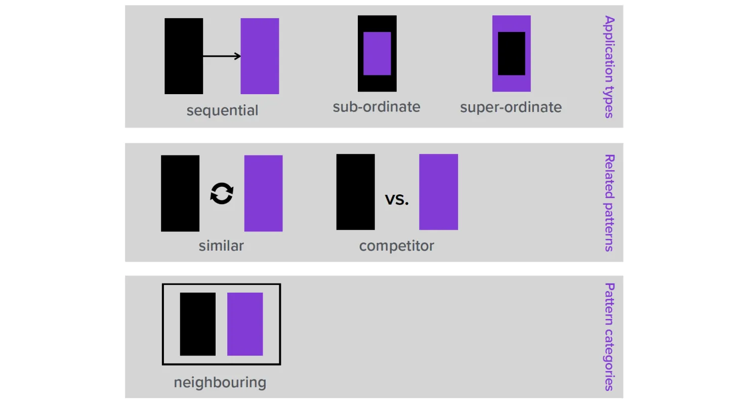
Hence, when creating kiwi, one of the biggest challenges was to visualise these relations between the 108 UI patterns which I had collected and designed. Based on the academic research, I defined 6 different relations that patterns could have with one another.
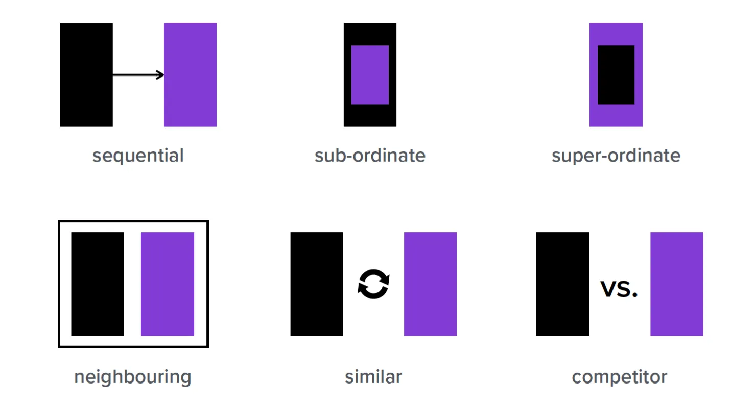 UI pattern relations: sequential, sub-ordinate, super-ordinate, neighbouring, similar, and competitor.
So far so good. Now, let’s move on to the design iterations of visualising pattern relations.
Iterations, iterations, iterations …
We iterated the design through user evaluations with usability testing, qualitative interviews, SUS, and UEQ. Let’s have a look at the iterations below.
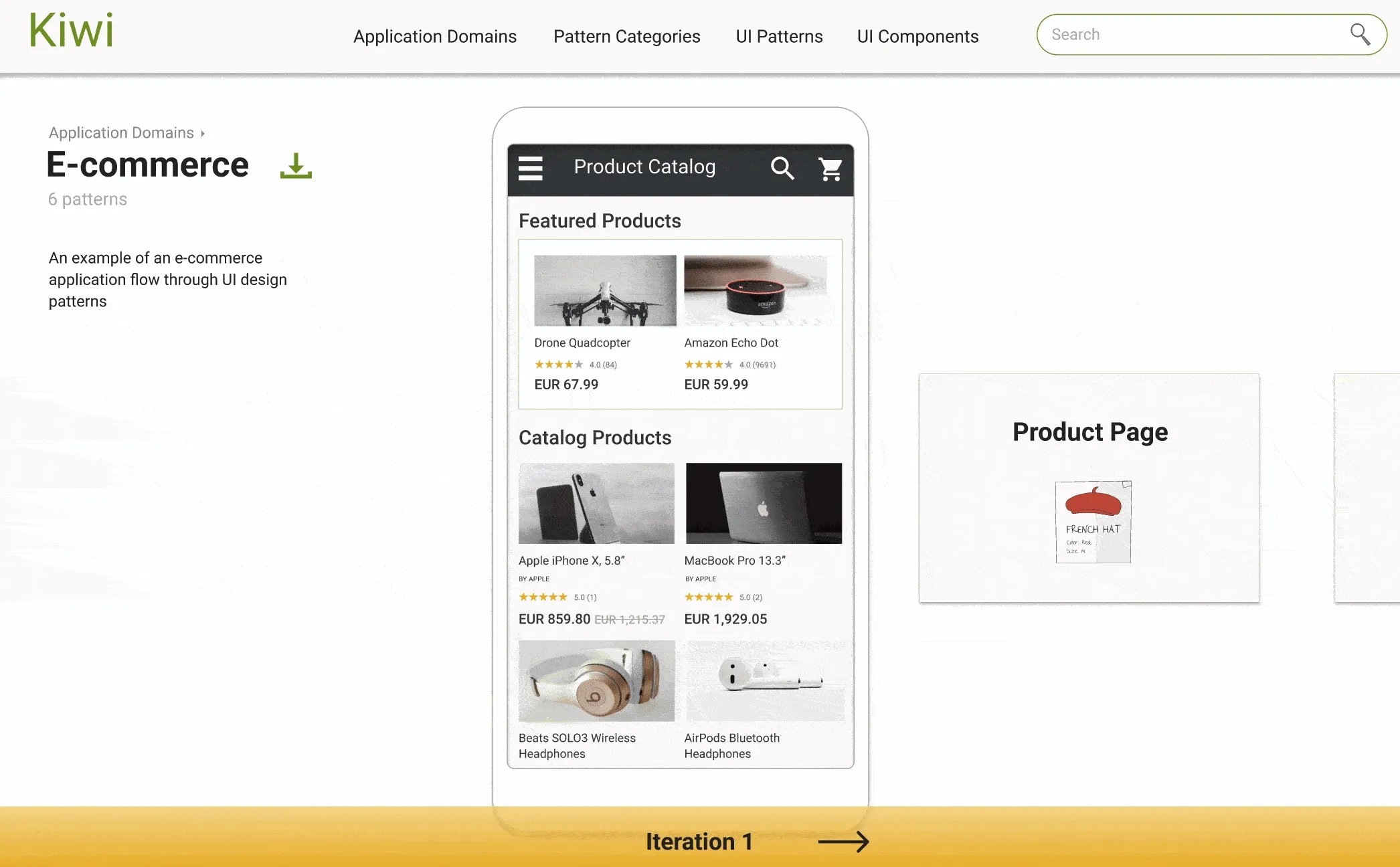
Iteration 1
The first attempt at visualising the relations looked like this, a flat schema with labeled arrows that connect pattern names with one another. The arrows are labeled to the scientific relations defined before.
 Iteration 1: The UI pattern relations of Product Page pattern in a flat schema
We evaluated this first design with 10 potential users from our target group. The main lesson that we learned was that the users couldn’t understand pattern relations through the scientific labels only, they were missing a sense of hierarchy.
Iteration 2
Alright, let’s have a look at the second try… Still a flat schema, but organised in a hierarchy and the arrow labels are simplified to a more common language. E.g. from “this pattern is a sub-ordinate of this other pattern” to “this pattern contains this other pattern”.
 Iteration 2: The UI pattern relations of Product Page pattern in a hierarchical schema
The next 5 potential users who evaluated this design weren’t happy with the amount of information they had to parse. Even though the language was simpler, it was still a lot of complex layout.
We had to reassess whether the direction we were taking was the right path.
We circled back to the idea that patterns work best together … that’s what we had to show!
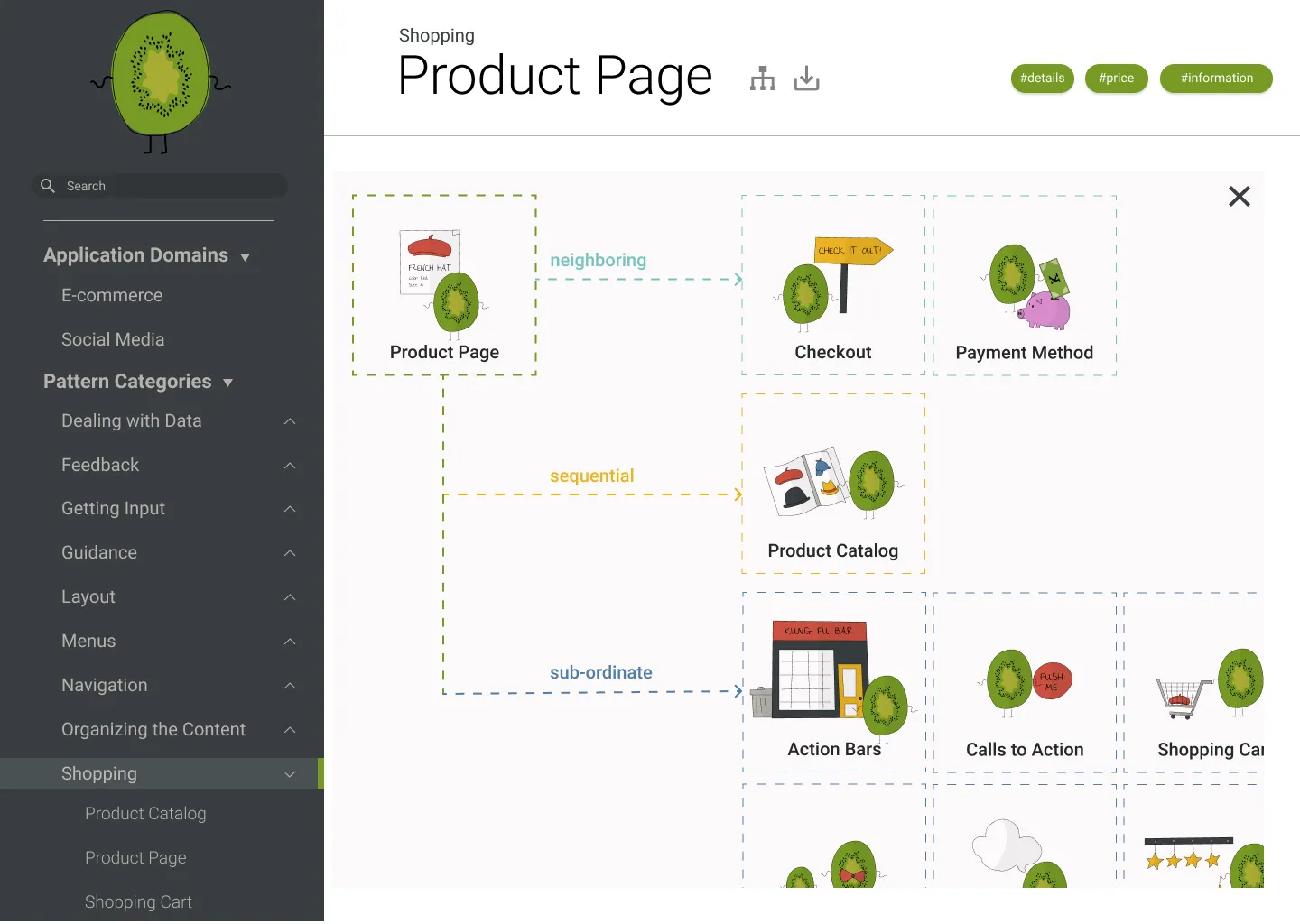
By now it was clear to us that the best way to show how patterns are connected with each other is to visualise how this works in practice through an interactive prototype. We called this an application type and it showcased an interactive prototype for a certain application, e.g. e-commerce.
 UI pattern relations grouped semantically by application types, related patterns, and pattern categories
Five additional iterations
The new idea went through 5 small iterations evaluated with 5-6 potential users each. The evolution affected the aesthetics, the information architecture, as well as the ease of use and understanding of the interactive prototype.
 Five iterations of showing related patterns through an interactive prototype
The final design
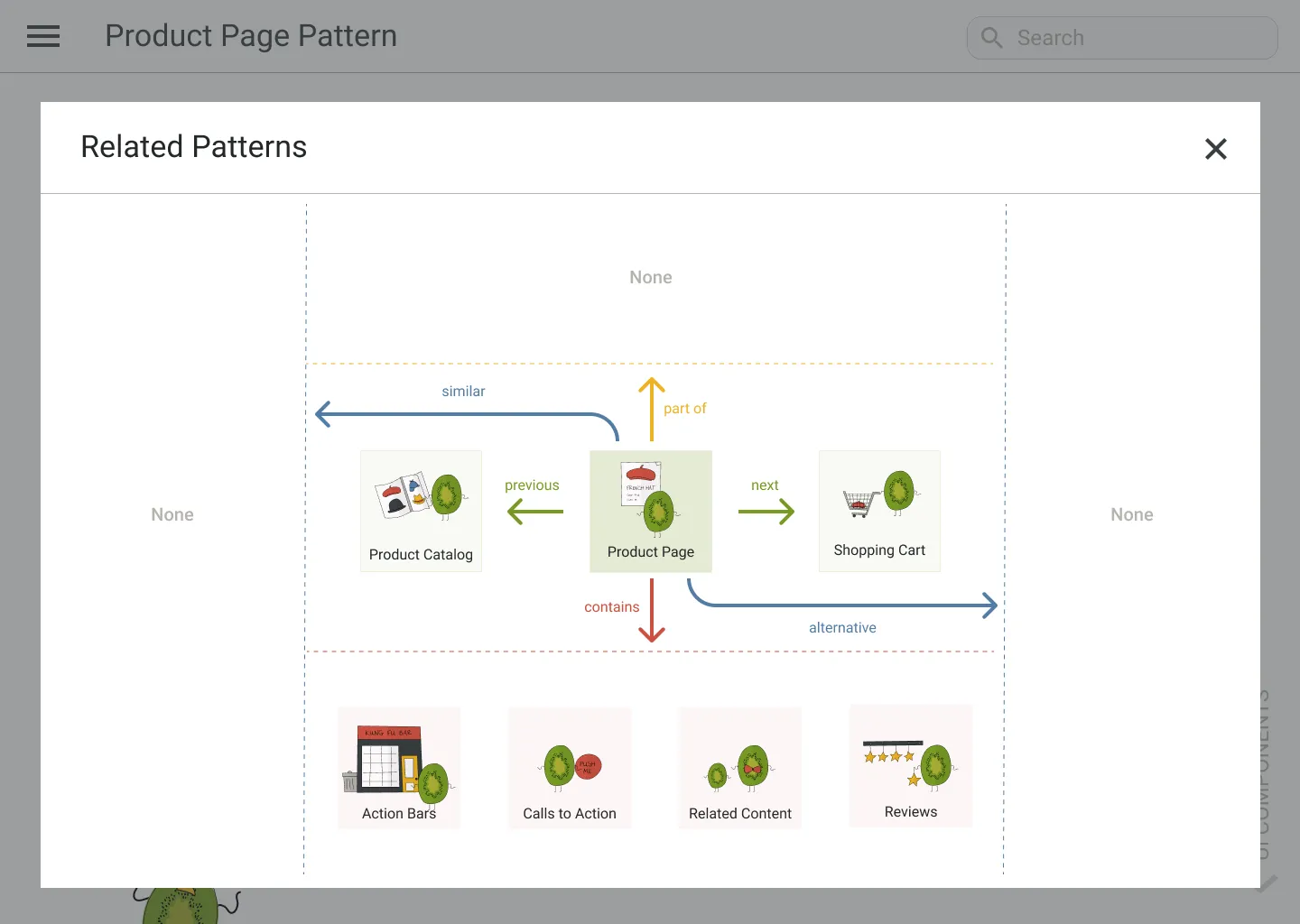
Below are shown the final designs after another evaluation with 7 more participants.
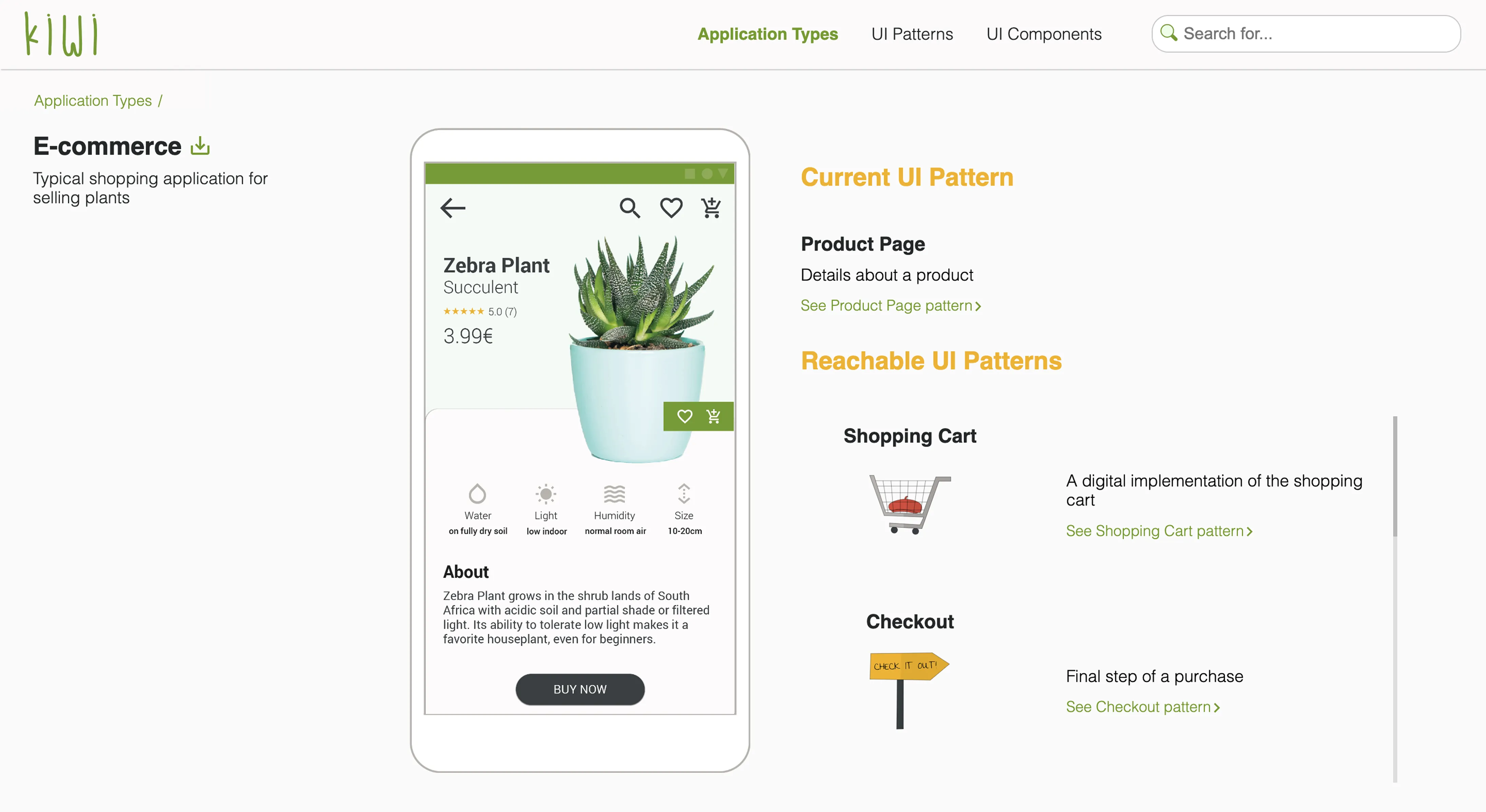
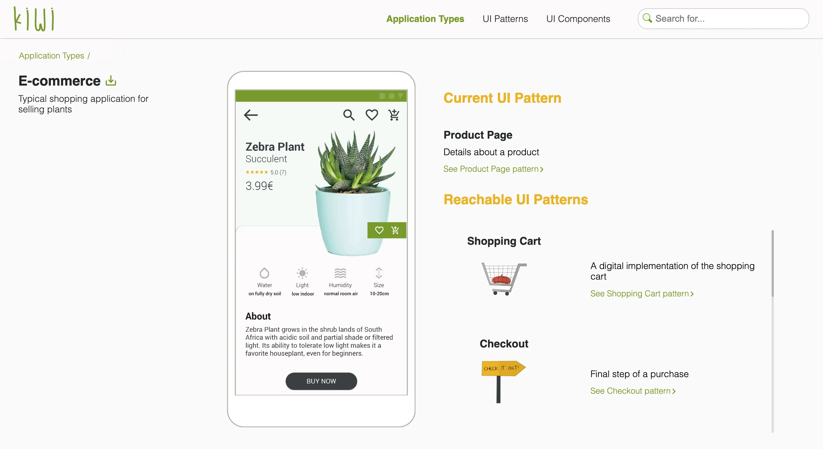 The final result: The UI pattern relations of Product Page pattern in an interactive application prototype
Another way how patterns are related are when they belong in the same category, e.g. shopping patterns, navigation patterns. We also made this clear through the information architecture on the website.
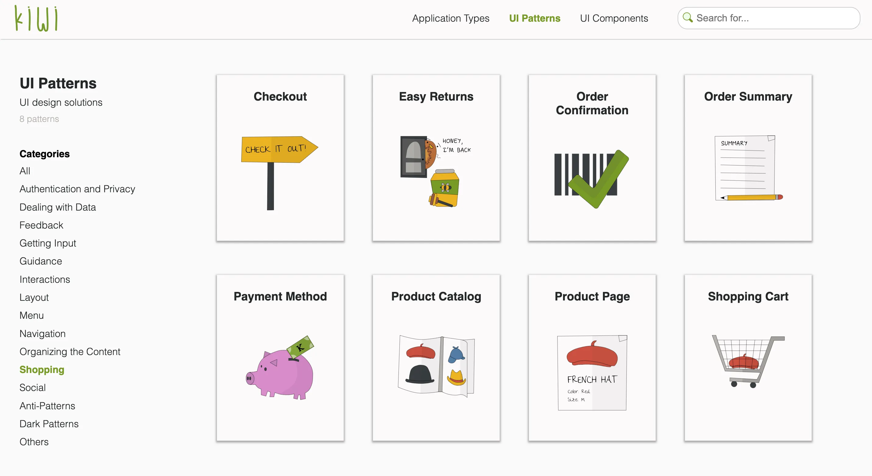 All UI design patterns related to online shopping
Another touch point of showing relatedness was in the pattern pages themselves.
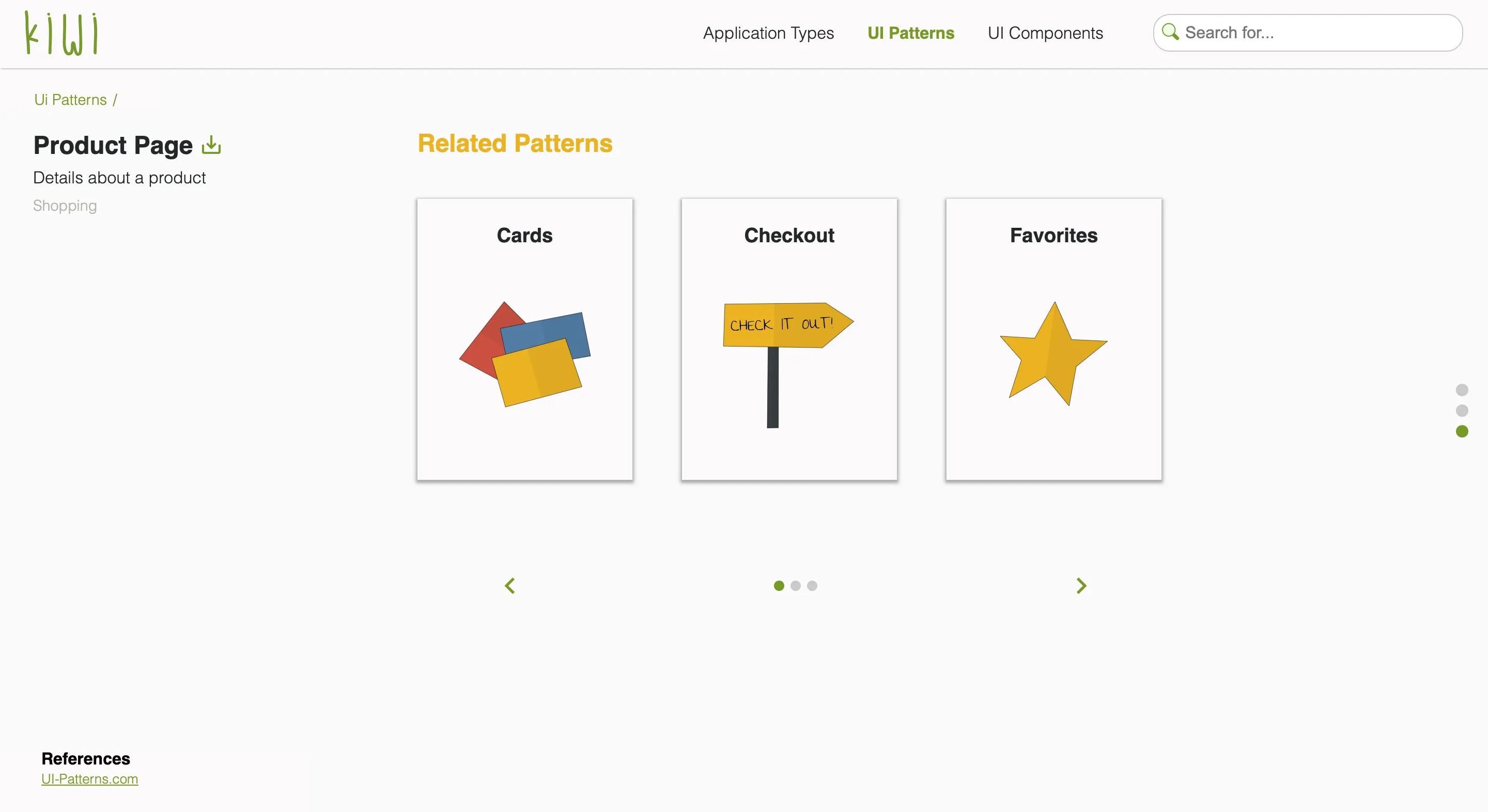 UI design patterns that are often used together with the Product Page pattern
The result
The final solution reached a System Usability Score (SUS) of 77.6, which indicated overall good usability.
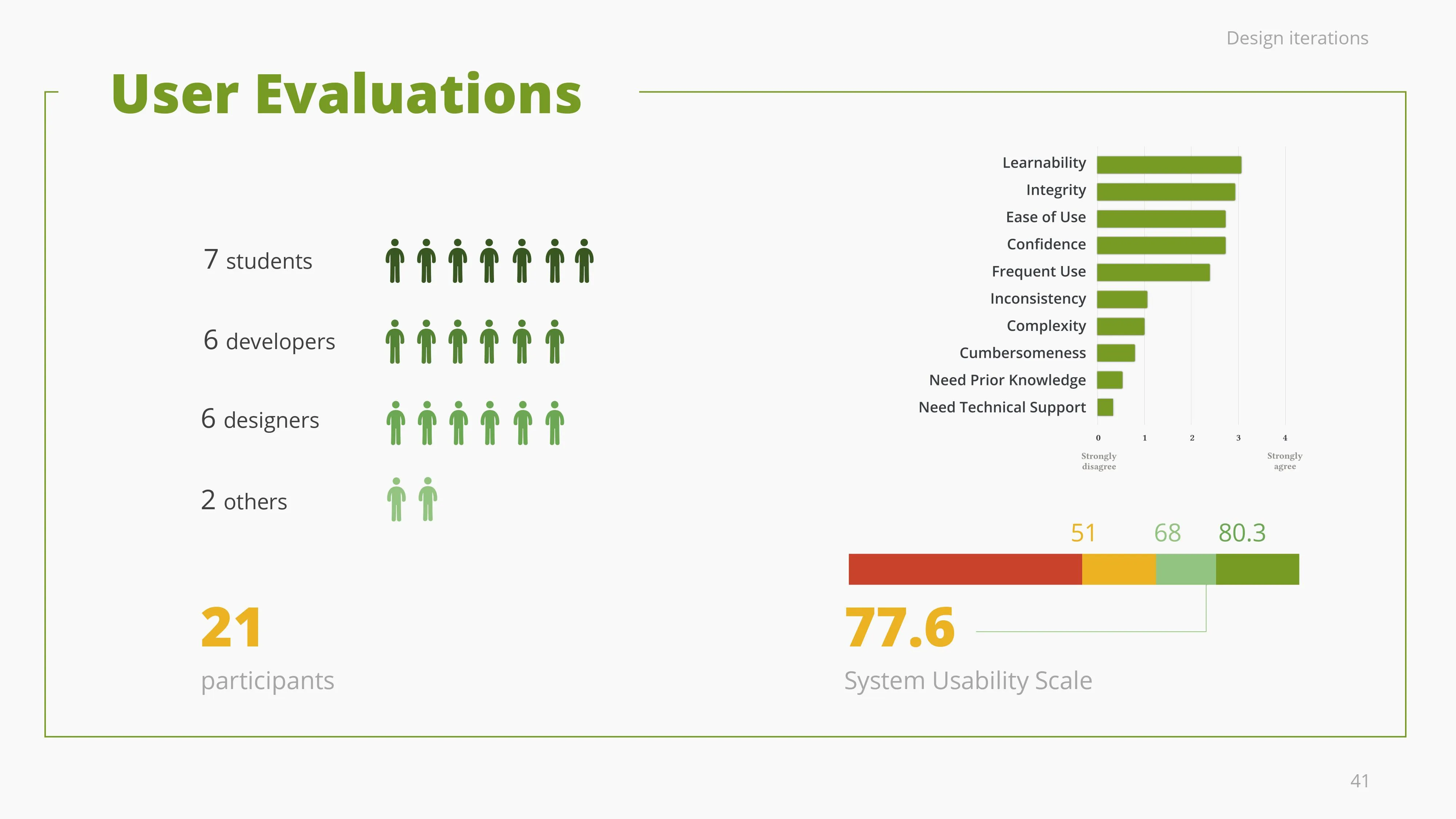 System Usability Score (SUS) of kiwi library: 77.6
As for the User Experience Questionnaire (UEQ) results, the areas with more room for improvement were dependability, i.e. the control users have on interaction, followed by perspicuity, i.e. how easy to use it is. The library scored good on efficiency and novelty. Overall, kiwi was evaluated as highly attractive and highly stimulative.
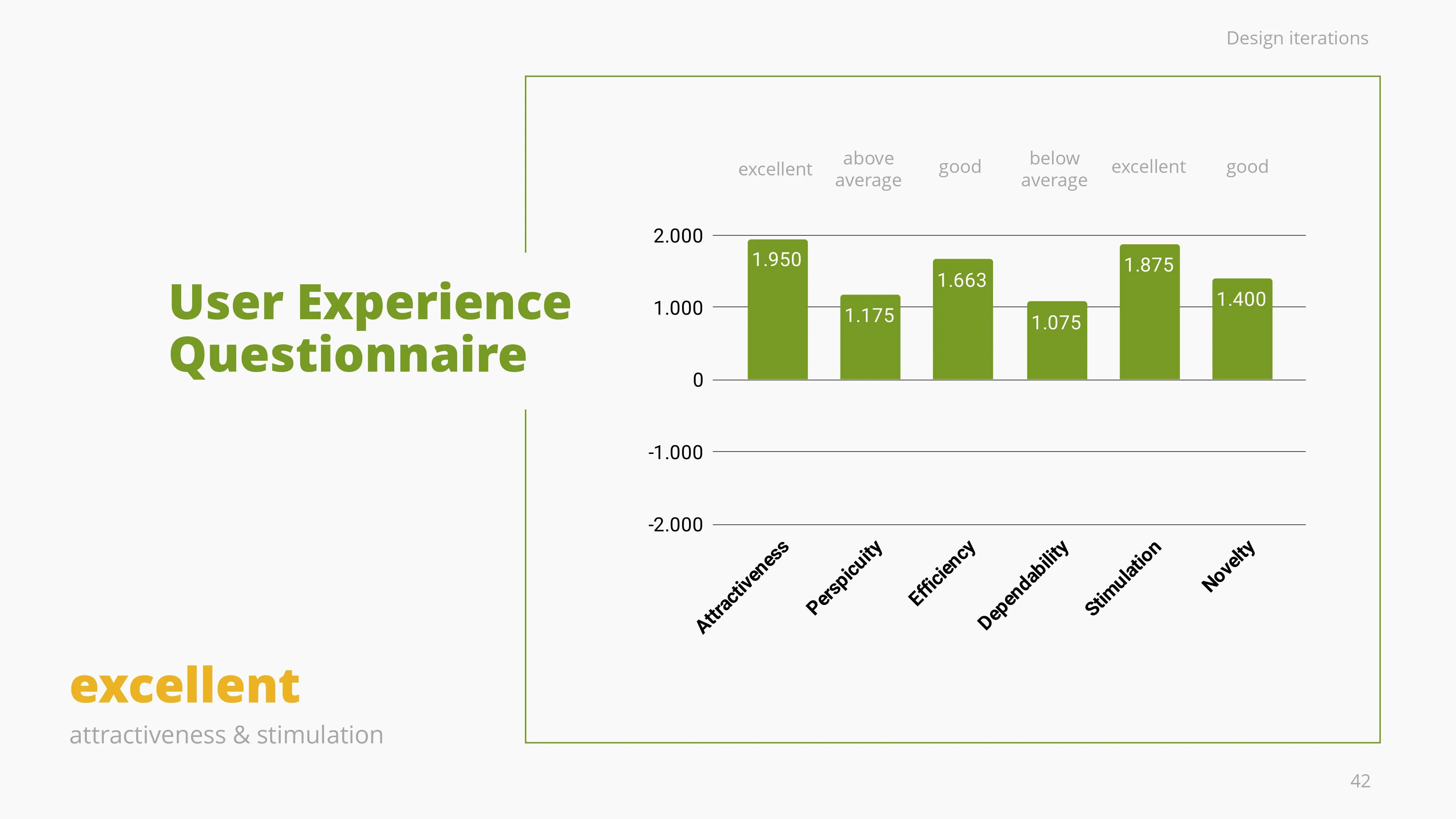 User Experience Questionnaire (UEQ) results
No one wants to read
In the design world, there is always the debate whether users read or not. Considering that context is king, we had to carefully consider the user scenarios of our target groups, i.e. rapid prototyping, learning UX design, or implementing good design.
Depicting pattern relations through text and name dropping (as we initially started) was not helping our target group with their goals, while using interactive prototypes to show how patterns work together was the way to go.
The academic success
Kiwi is a scientific contribution on UI design patterns and was published in the MobileHCI’19 conference in Taipei and the paper is referenced on the ongoing study of UI design patterns. Give the paper a read.
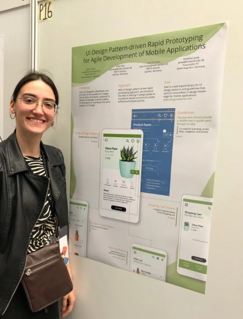
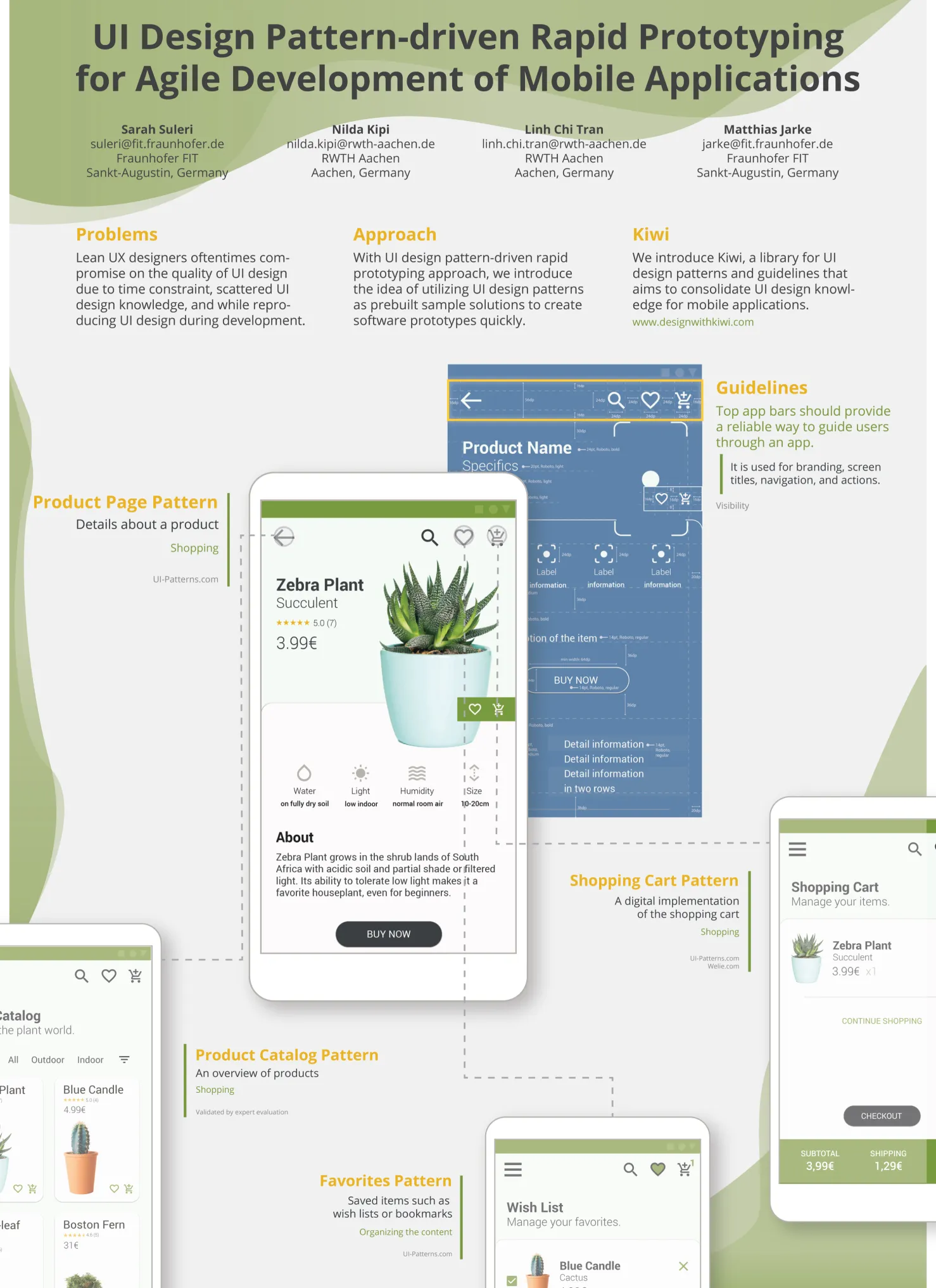 UI design pattern-driven rapid prototyping for agile development of mobile applications
What did I learn?
The three main takeaways for me from this challenge were:
- Question yourself during the iterations if you are on the right path.
- Simplify as much as you can.
- Show not only tell.
Let’s try some kiwi 🥝
I downloaded three application types from kiwi: e-commerce, food, and music. I designed all the mobile patterns back then in Illustrator due to some issues with SVG export in Figma.
After importing the SVG files back in Figma, the text is not added correctly. So, it takes a couple of hours to arrange the text and make some small reformatting.
EDIT: Now that AI is among us, this should be a piece of cake amirite.
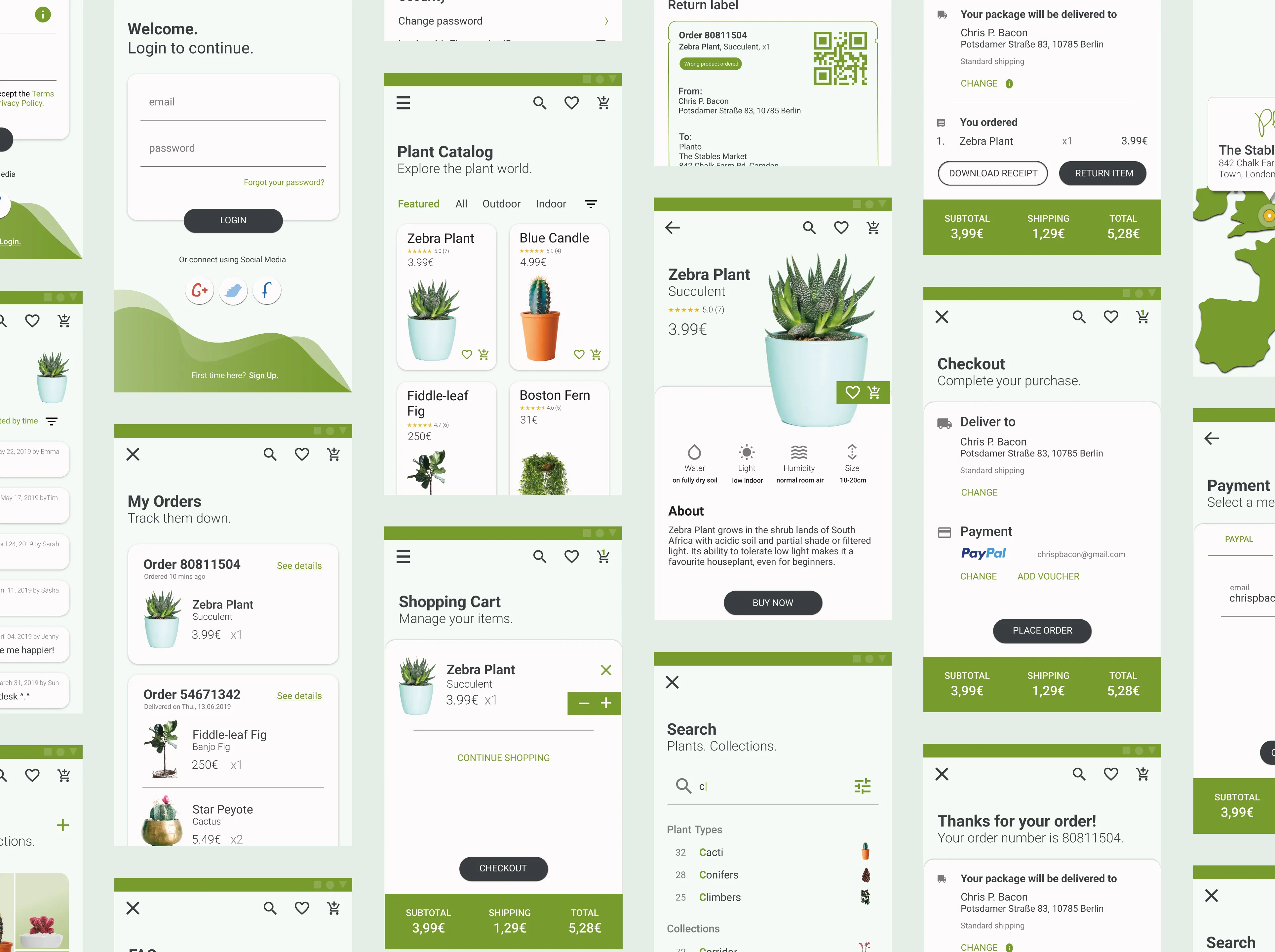 The UI mobile patterns for a plant e-commerce app I designed for the kiwi library
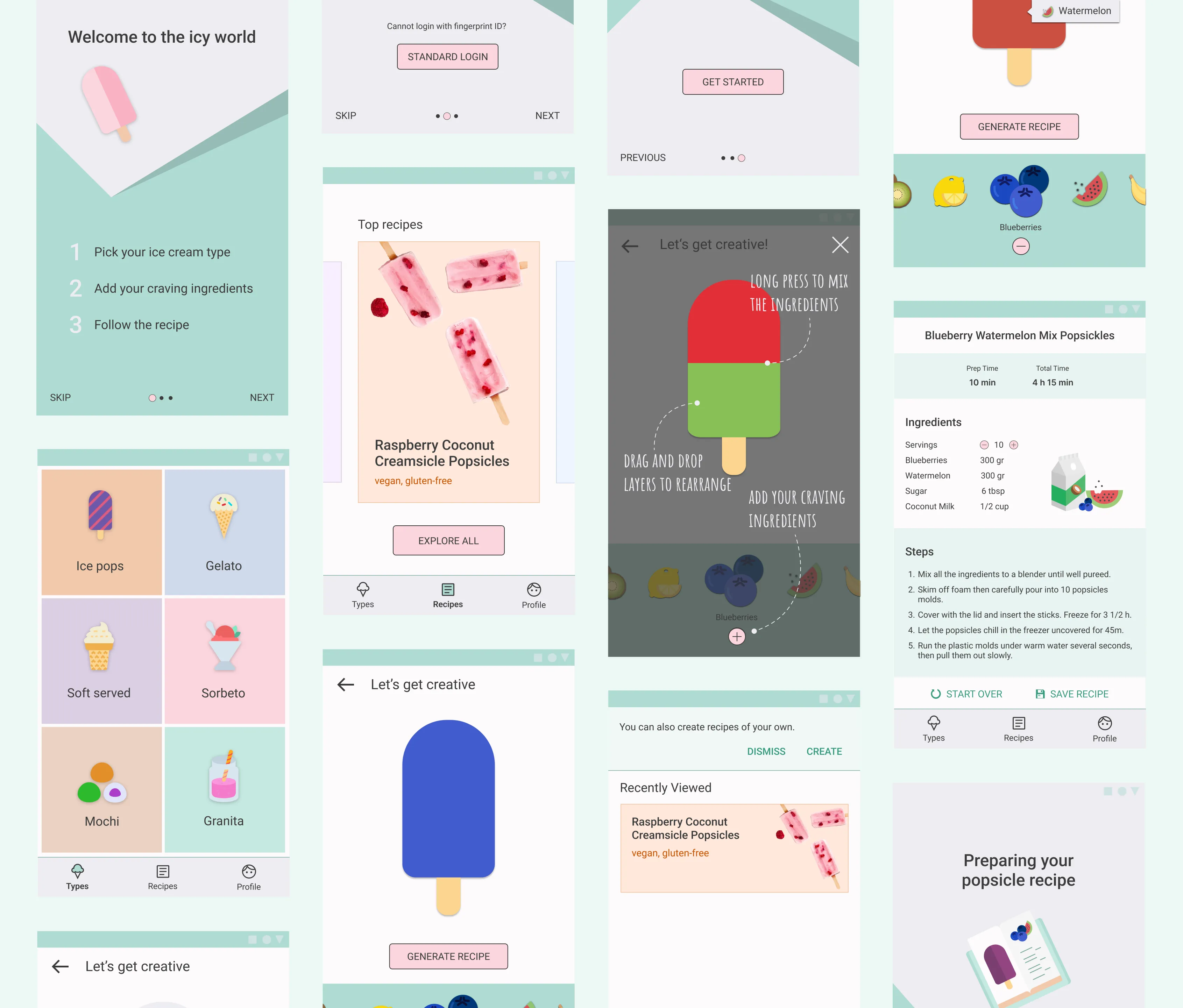 The UI mobile patterns for an icecream recipe app I designed for the kiwi library
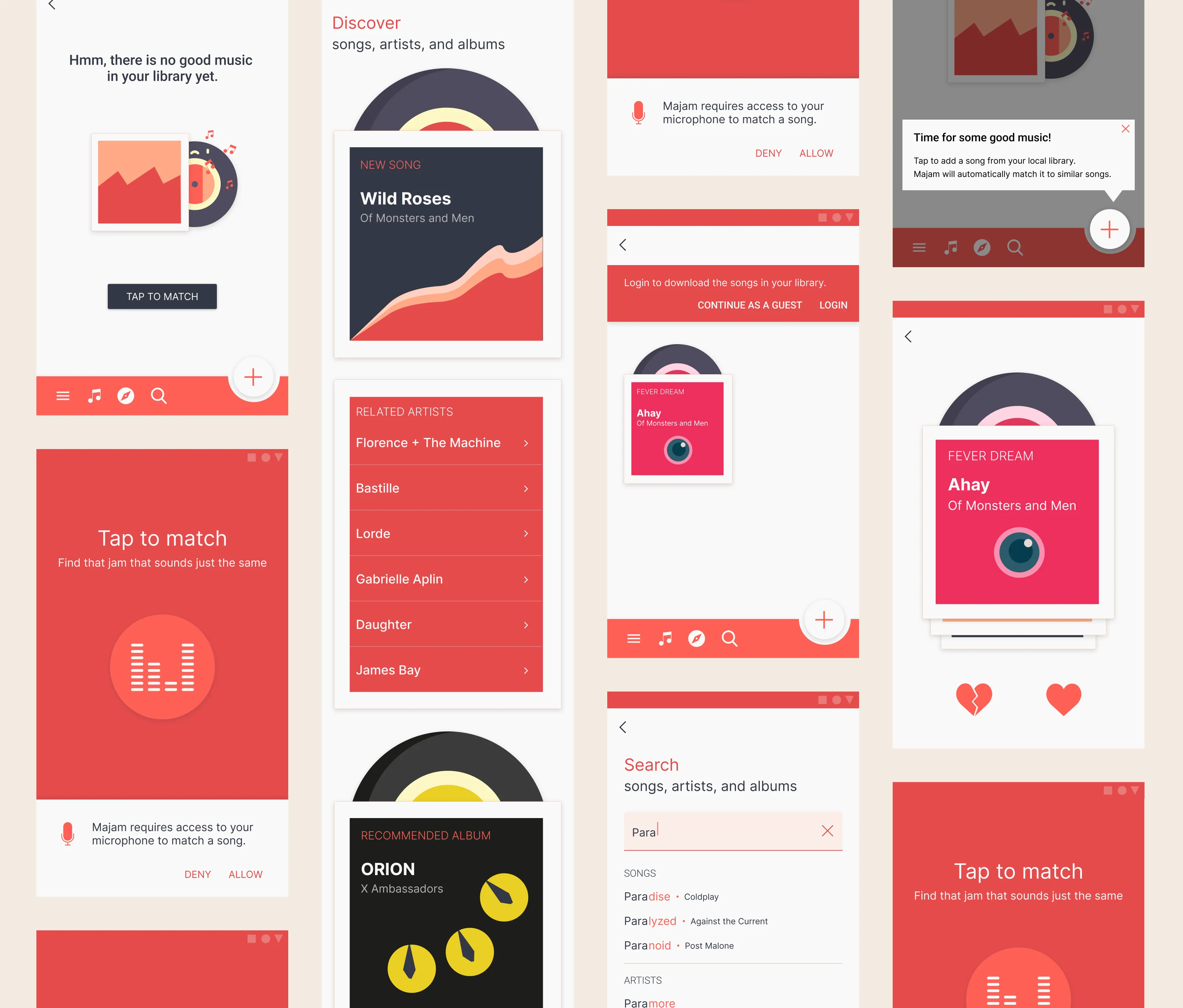 The UI mobile patterns for a song matching app I designed for the kiwi library
The AI era
This UI design pattern library was built in 2019 to consolidate scattered design knowledge for humans. Now, as of 2026, humans can put their AI agents to work. Turns out, structured design knowledge makes for pretty good guardrails. Yeah, I think kiwi was onto something. 🥝
Other work
Paulina24Increasing conversion rates through deep funnel analysis
The startup saga continues. The heroine is back to save the day.
KironEnabling learners to organise their e-learning experience
Working at Kiron has been fulfilling, challenging, transformative.
concludioAnalyzing churn within a lean startup context
My friends say I was brave to take the entrepreneurial route. I'd like to believe that.