
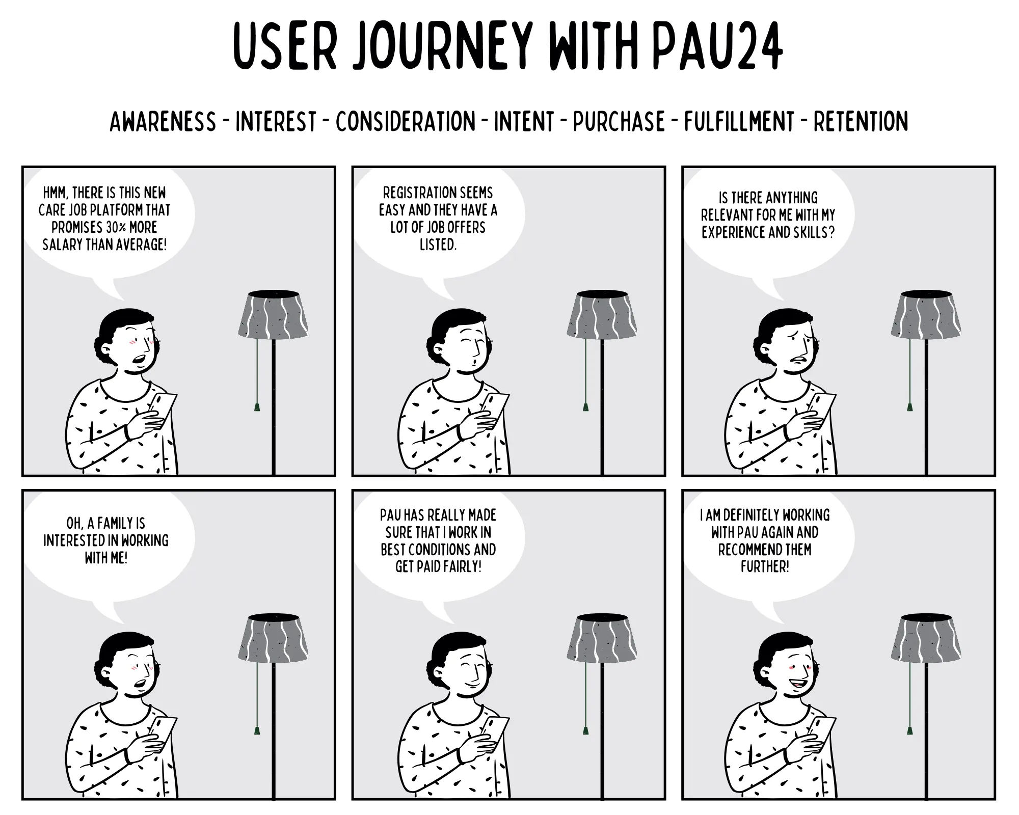
Increasing conversion rates through deep funnel analysis
The startup saga continues. The heroine is back to save the day.
- Challenge High drop-off rate in the signup flow
- Industry Care marketplace (B2C)
- Target Audience Caregivers from Poland, Romania, and Bulgaria
- Audience Scale 2k-4k monthly funnel visitors
- Device Mobile
- Research Drop-off analysis (Matomo), session recordings (PostHog), error logs (DataDog), onboarding survey, user reports
- Steps Identify drop-off → analyse assumptions → experiment with solutions → roll out changes
- Constraints Multilingual user base, low digital literacy
- Duration Around 1 year of iterative changes
- Impact +42.9% improvement in signup conversion rate
About Paulina24
Paulina24 is a marketplace that connects caregivers from Poland, Romania, and Bulgaria with families in need of 24-hour care in Germany.
I joined Paulina24 very early on in the game. As a ProdTech team of five (myself, three developers, and the CTO) we were tasked to build the product from scratch (referred to as v2 below).
There was already a one year old product (referred to as v1 below), but it was deemed as a legacy, due to its complex UX and technical implementation.
More hats back on
I was hired as a Senior UX Designer, but as we all already know the nature of startups, one cannot simply be one thing. Leadership trusted me also with more Product Management responsibilities.
On top of the usual design (yes, of course I did build a design system) and research work, I was also responsible for defining the product’s strategic direction, scoping projects, and figuring out team processes.
Not to forget the cherry on top, I gave myself the challenge to setup a product analytics system in Python that would answer questions around our key success metrics and performance. Yes, Claude did help me. And yes, we shall discuss this in a separate case study (coming soon).
The caregivers
Before doing anything else, I wanted to know who I was building this product for. Due to the language barrier I had to find an alternative way to user interviews. Aaand what other better tool than 🥁🥁🥁 surveys? Name one!
I had some fresh cool knowledge in my arsenal from the UX course by growth.design. Highly recommend them.
I asked questions to identify caregivers’ Jobs‑To‑Be‑Done, better understand their context, as well as understand the blockers and enablers during signup completion or when finding the next job.
 The MAP (Motivation, Ability, Prompt) questions as survey objectives
Objectives
The survey aimed to identify the levers that drive or block a behaviour through the MAP (Motivation, Ability, Prompt) framework:
- Motivation: Is the caregiver motivated enough at that moment to register with us? (anticipation, sensation, belonging)
- Ability: Does the caregiver have the capabilities of registering with us? (physical, mental, time, money, habit)
- Prompt: How to nudge the caregiver to act at the right moment? (explicit, implicit)
To map these objectives onto the survey, I used two types of questions: General Empathy Questions (GEQs) to surface the impact levers that drive or block behaviour, and Specific Empathy Questions (SEQs) to dig into the concrete blockers and enablers at each stage.
 GEQs as behaviour impact levers
Behaviour impact levers
- If you had a magic wand and could instantly find a better-paying care job, how would that change your life?
- What’s your #1 challenge when it comes to finding a better-paying care job? And why is it so challenging?
- Tell me about the last time you tried to find a better-paying care job, how did that go? What was preventing you from achieving your goal?
 SEQs as behaviour blockers & enablers
Behaviour blockers & enablers
- What convinced you to register with Paulina24?
- What made you hesitate the most before registering?
- What makes you think twice before taking a new care job?
- What makes you want to apply for a new care job?
Results
The survey shaped our understanding of the caregivers’ mental model. It informed how we framed the messaging from the landing page through to signup and ensured that we keep the big picture in mind.
The results are confidential.
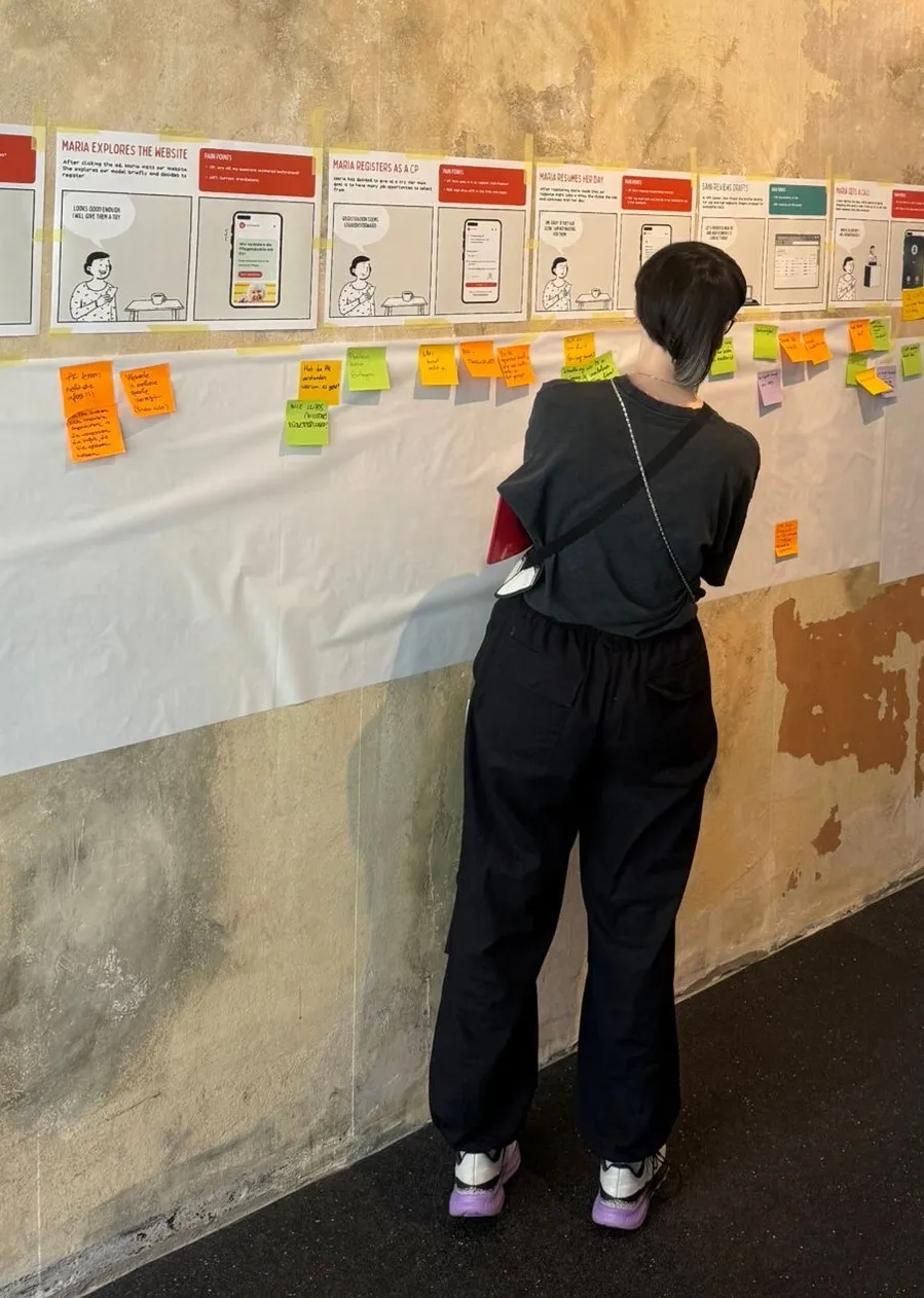
 The overall caregiver journey storyboard
The signup funnel
Since we are storing sensitive information about the caregivers and the families in our marketplace, it is important that the caregivers authenticate themselves.
The caregiver’s profile is also crucial in proposing matching jobs as well as handling bureaucratic paperwork.
The top of the funnel was where we observed the highest drop-offs. Very few dropped off in the later steps of the signup funnel.
We used Matomo to track the funnel and get a sense of its performance. To dig deeper we used PostHog for session recordings and DataDog for error logs.
At the same time, we got continuous feedback from caregivers themselves on facebook or via our customer support team.
 The signup funnel journey storyboard
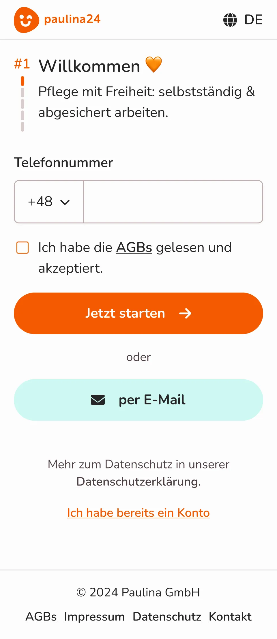
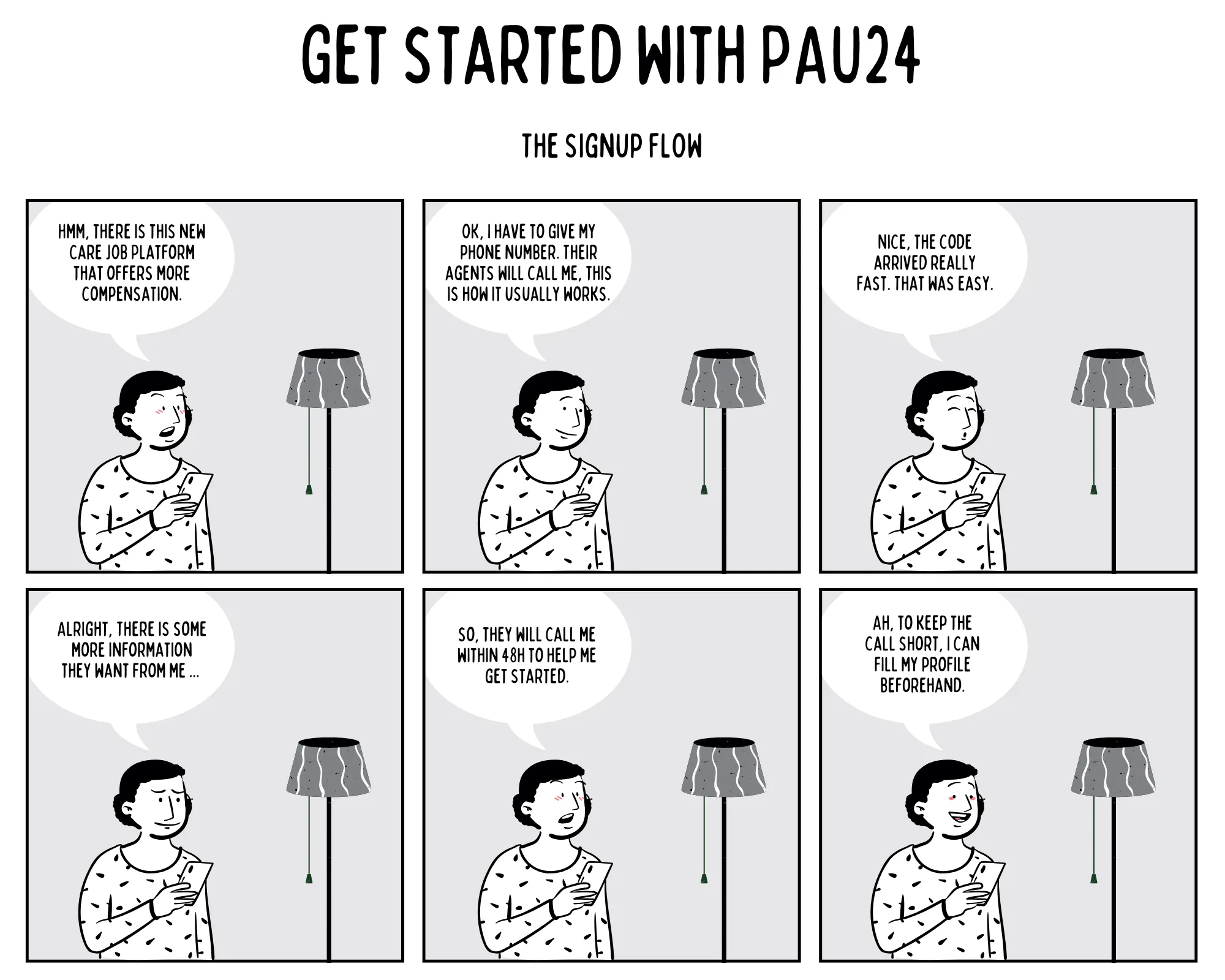
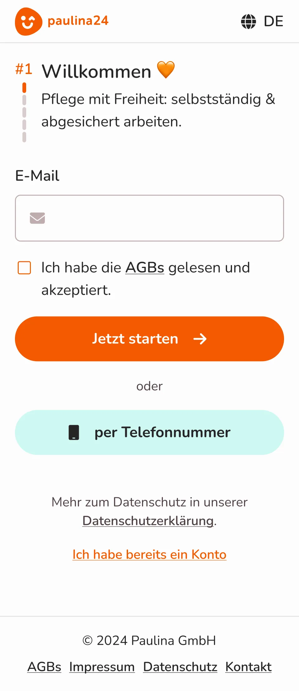
v1: authentication via email and password
The email field had •••• drop-offs, while the password •••• drop-offs, for a total •••• drop-offs from the form starters alone. On top, there were additional •••• drop-offs from the visitors who didn’t start the form at all.
My main assumption was that since our target audience has low digital literacy, creating new passwords and managing them is always a challenge.
With over 80% of our audience on mobile-only devices (mostly Android), SMS authentication felt like a natural fit. Most of the mobile OSes can also read the codes automatically, which simplifies the experience.
The total conversion rate of the funnel at this point was on average ••••.
 v1 email + password screen
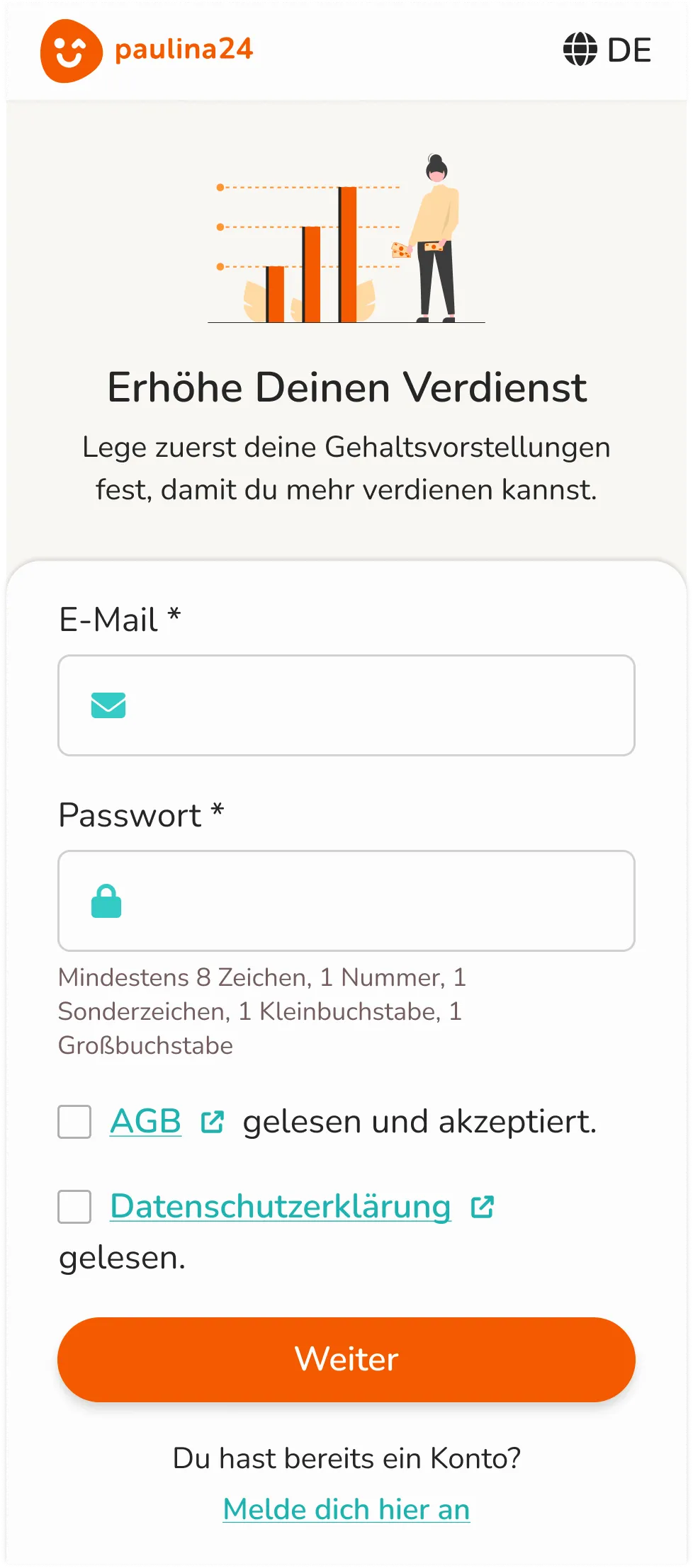
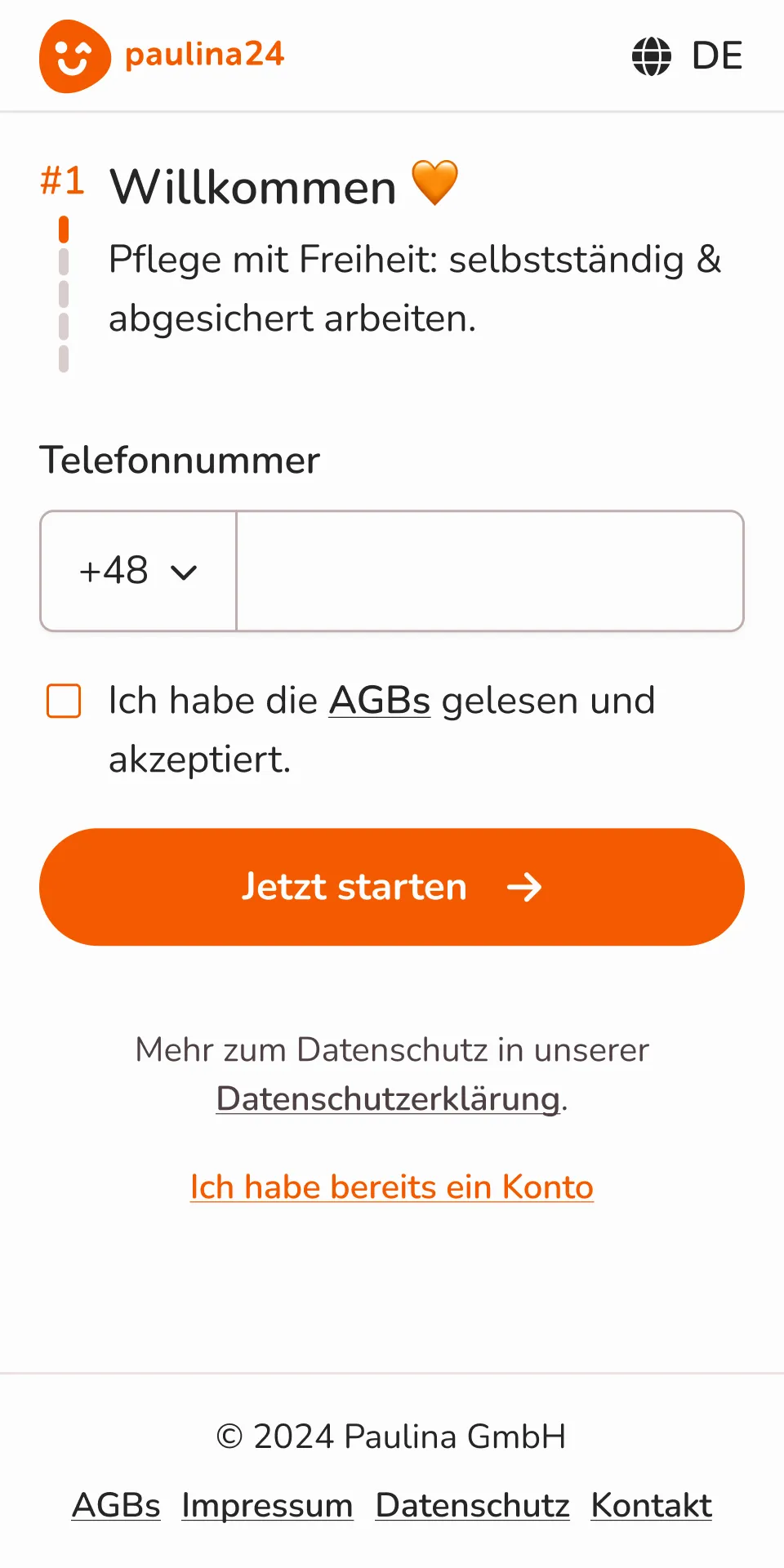
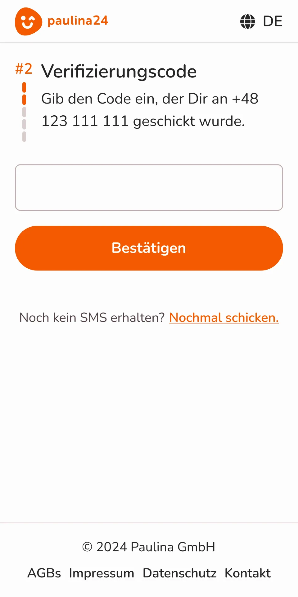
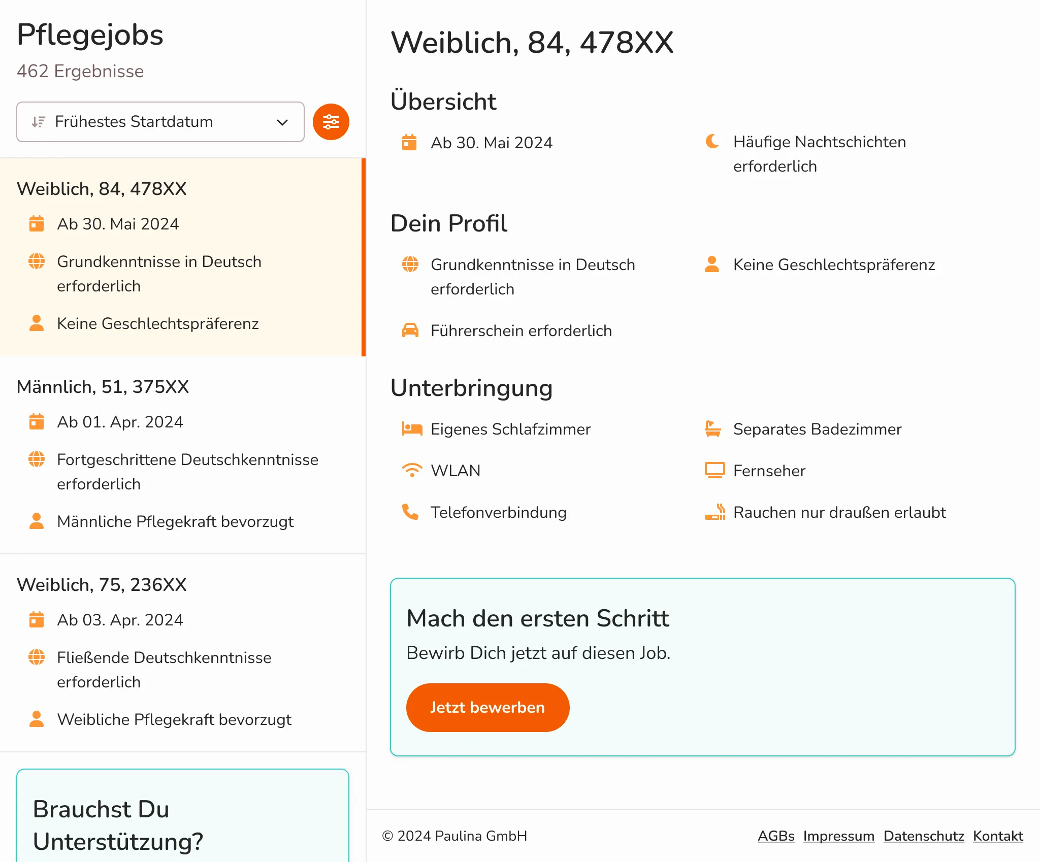
v2.1: authentication via phone number and one-time verification code
As we started the implementation from scratch, we implemented the new authentication flow with Firebase.
The drop-off in the first step reduced to ••••. However, we had •••• drop-off in the second step (one-time verification code).
Via error logs in DataDog and session recordings in PostHog we found out that the users were not getting the SMS reliably via Firebase.
After thorough research, we decided to switch the authentication provider from Firebase to Twilio. The drop-off in the second step reduced to ••••.
The total conversion rate of the funnel with Firebase authentication was on average ••••. After switching to Twilio, the conversion rate increased to ••••.
 v2 phone number screen (funnel step 1)
 v2 one-time verification code screen (funnel step 2)
v2.2: adding email as an alternative option
Once we introduced Twilio, the drop-off in the first step increased up to ••••, due to stricter phone number validation.
To mitigate this, email was added as an alternative option for authentication, also paired with a one-time verification code. The total drop-off in the first step reduced to ••••.
Adding email increased the total conversion rate of the funnel up to ••••. That was a total of •••• improvement compared to v1.
v2 email as alternative (funnel step 1)
 v2 phone number as alternative (funnel step 1)
Extra experiments
A/B tests
On top of the funnel improvements above, we also did small A/B tests regarding the copy, e.g. the description in the first step of the funnel:
- Earn up to 30 % more as a self-employed caregiver. (control)
- Care with freedom: work independently and fully insured.
Who do you think it was the winner 🧐? Hint: Not the 💰💰💰.
••••Open store front
Another experiment was opening our jobs to public with limited information, so we wouldn’t leak any patient PII or other sensitive data.
We wanted to test whether framing signup as “applying for a job” would drive more conversions.
The hypothesis was rejected. While observing the session recordings, I noticed that when caregivers filtered the jobs with their preferences, they often got no results. Getting filtering right is a hard challenge.
Also, if one considers the real life process of matching a caregiver with a family, it requires a lot of back and forth communication and negotiation.
 All jobs view in large screens
 Empty jobs view in large screens
On context and decision-making
It might be tempting to be guided only by the numbers…
Facebook comments and customer service reports also pointed to a recurring pain point: users weren’t receiving codes or that their phone number was flagged as invalid.
Ever since the last iteration we have zero such comments/reports.
As for the competitor landscape, it is quite common to share a phone number, email, and additional details to get contacted back with a job offer. It is a matter of security, data privacy, and familiar user experience on how to approach this.
Alternative options
One might rightly ask, why not social login with Facebook or why one-time code instead of a magic link.
Re: Facebook login, it’s true that most of our users were coming from Facebook, but it would have been just an extra step only to authenticate, as we still needed their phone number and email. However, this could still be a future addition.
Re: magic links, we ruled them out to keep the experience consistent with SMS codes, and to avoid the risk of the link opening in a different browser context and breaking the flow. Plus some other security concerns.
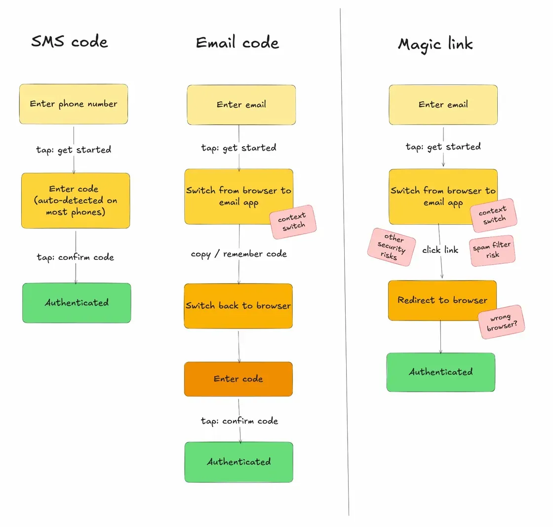 One-time code vs. magic link
Interpreting the results
To isolate the impact of the authentication changes, let’s look at a separate metric: how many visitors of the landing page start the signup funnel?
During the v1 period, we had a smaller audience with around •••• conversion rate of landing page visitors to the signup start.
During the v2 Firebase period, the audience doubled in size and in parallel we also released a new landing page. We observed a •••• conversion rate of landing page visitors to the signup start. (The rate could be skewed due to testing!)
During the v2 Twilio period, the audience increased by 1.5x, but the conversion rate of landing page visitors to the signup start normalised to ••••.
••••Why focus on that one metric?
Fair question. Getting a stable error-free signup funnel was above all crucial for the marketing team in measuring the performance of their campaigns.
Secondly, having a big pool of caregivers was one of our business goals, as it impacted our north star metric: ••••.
The signup funnel can be further optimized in terms of UX alone, but as we shall see in the next Paulina24 case study (coming soon), it is not the priority anymore. The rest of the caregiver journey will come to focus.
Other work
KironEnabling learners to organise their e-learning experience
Working at Kiron has been fulfilling, challenging, transformative.
concludioAnalyzing churn within a lean startup context
My friends say I was brave to take the entrepreneurial route. I'd like to believe that.
kiwiVisualizing UI pattern relations through interactive prototypes
My master's thesis marks the beginning of my UX design career.